


Are you ready to bring your Webflow website to mobile? Start here

Are you ready to bring your Webflow website to mobile? Start here
Published on:
12 December, 2025
By Webtonative
Author
Are you ready to bring your Webflow website to mobile? Start here
Webflow is one of the most valuable no-code platforms that allows you to build and manage a professional website visually. That is why many businesses use this platform as a main web foundation.
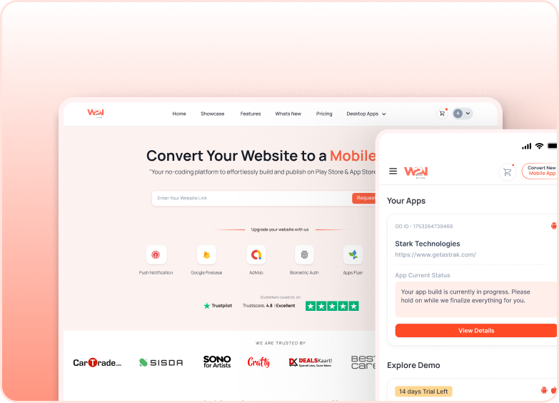
Transforming your website into a native app can take this foundation further, opening new opportunities for growth and reaching more customers. WebToNative is the only highly valuable and credible platform that lets you extend your web foundation to mobile without redoing your work. Your project works inside the native shell with improved speed, better interaction, and app store visibility.
Here, you will find a complete setup from creating to publishing, including app functionality, advanced features, testing your builds, and much more.
Why Your Webflow Website Needs to be on the User’s Screen?
No Difference in Functionality: You do not need to start everything from scratch. Every single feature runs smoothly inside your native shell.
Get a More Seamless Experience: It is way smoother than mobile browsers in terms of faster loading times, easy navigation, and staying logged in longer. Your users enjoy a smoother experience.
Advanced Mobile Compatibilities: With the help of WebToNative, your Webflow project can use features that are not possible with mobile browsers, like:
- Biometric authentication
- Push notifications
- Deep linking
- Camera and file access
Reliability Through App Stores: Gaining legitimacy through the app store is one of the best ways to engage with new users and enhance brand credibility.
Ideal for Creators, Saas tools, and Business: If your Webflow website is used regularly, like dashboards, learning platforms, and membership sites, a native mobile app makes it more accessible.
Things You Have to Review Before Your Mobile Conversion
-
Make Sure Your Pages are Easily Accessible on Mobile Devices If your website pages are clean and running properly in the mobile preview, they will look great inside the native Webflow app. Just avoid desktop or extremely wide screen layouts.
-
Confirm that Your Website is Live on a Secure Domain Ensure that your website is live on an HTTPS link. This way, your pages load safely inside the Webflow native app.
-
Check Your Navigation Smoothness Check everything from start to end, including layout, screen size, loading times, and all. This will help you enhance user experience.
Step-by-Step Process of Building a Native Mobile App from a Webflow Website
Step 1: Enter Your Webflow Web App URL Insert your Webflow website URL on https://www.webtonative.com/. This converts your Webflow web app into a native shell.
Step 2: Get Your App File Wait for a while as WebToNative completes your build. Now, download your app file.
Step 3: Start Your App Customisation Branding Upload your:
- App name
- App icon
- Splash screen
- Background colour
- Layout stylish and more
Step 4: Enable Features You Want Turn on features you want your app to behave like:
- Push notifications
- File and download access
- Downloads and Uploads
- Geo Location services
- App Syncing with Website
Step 5: Test Your Mobile Features on Actual Devices After Installation There are two options for iOS and Android devices. Choose the appropriate option, click on the download button, and check:
- Page loading speed
- Animation
- Login/Sign Up
- Navigation and gestures
- Layout style and size
Step 6: Download Your Final Build Once you are satisfied with all the production work, this is the time to download and launch your Webflow app on the app stores.
Step 7: Publish Your App Upload your app package and fill in the required things, like adding a screenshot, filling in the description, and ultimately submitting it for review. Once they approve your app, it is available to the world for installation.
How It Helps in Expanding Your Business and Reach to More Users
Turning your website into a native mobile app is not just a change; it is a way to reach users where they feel most comfortable. It is a closer connection with the users and delivers them faster access and easy navigation.
Instead of dealing with browser limits, it offers a clean, app-like experience that feels both professional and reliable. The features such as push notifications, local storage, and location services encourage users to open your app and stay connected for a longer time.
So, whether you want to grow your business or publish something new, having a native app directly enhances your brand presence.
Frequently Asked Questions
Q. Is a redesign required before converting my Webflow web app into a native app? No, if your website is already mobile-friendly, you do not need any redesign or rebuilding for your native app.
Q. What if my Webflow uses external scripts? The scripts that are working properly in the mobile browser will work inside your Webflow app as well.
Q. Can I keep managing my app through my Webflow website? Yes, you can manage every single aspect of your app from the website’s CMS and designer. This will update automatically inside your Webflow native app.
Final Thoughts
In summary, you know users always trust an app more than a web browser due to their presence on the app stores. Also, people use the app more quickly and spend most of the time on the app rather than navigating page to page. In this digital era, turning your website into a native app is a direct business from two places.
Carefully reading this guide will help you make a fully optimised and successful app in just a few steps. So, this is the time to convert your website now and open the door to new business opportunities with already built functionality.
Similar Blogs