


Bottom Navigation Tab
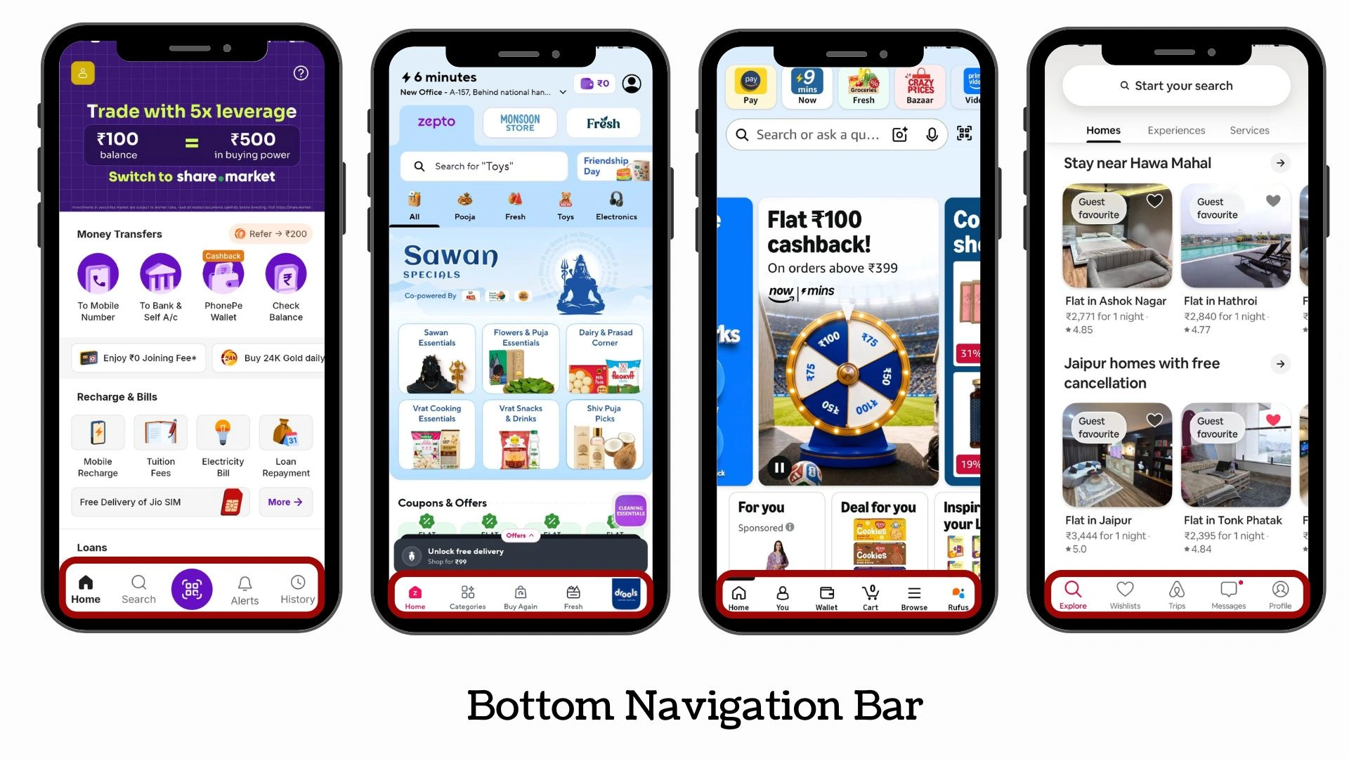
A bottom navigation bar is a persistent row of icons pinned to the bottom of every screen in your app. Each icon represents a primary section — Home, Search, Orders, Profile — and tapping one instantly switches the view. It's always visible, always reachable, and never requires the user to open a menu or go back to find where they are.
You'll recognize this pattern from every major app: Instagram's feed, explore, reels, shop, and profile tabs. YouTube's home, shorts, and subscriptions. Spotify's home, search, and library. Bottom navigation is the most widely used navigation pattern in mobile apps — for good reason.
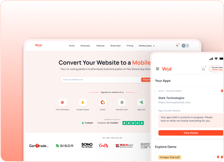
This add-on is available for both Android and iOS. You can start with the Starter plan to access this Add-on for free on Webtonative.
Why bottom navigation works better than top menus?
Thumb zone access
The bottom of the screen is where thumbs naturally rest on modern large smartphones. Users can switch sections without shifting their grip or using their other hand.
Instant section switching
One tap to jump between 3–5 primary destinations. No hidden menus to open, no back buttons to press, no drilling through levels of navigation.

Always-visible orientation
Users always know where they are in the app. The active tab is highlighted at all times — preventing the "lost inside the app" feeling that comes with deep navigation trees.
Where to Find It In Your Dashboard
My Apps ➡️ Edit your app ➡️ Add-ons ➡️ UI & Navigation ➡️ Bottom Navigation
Steps to implement bottom navigation bar on your app with Webtonative
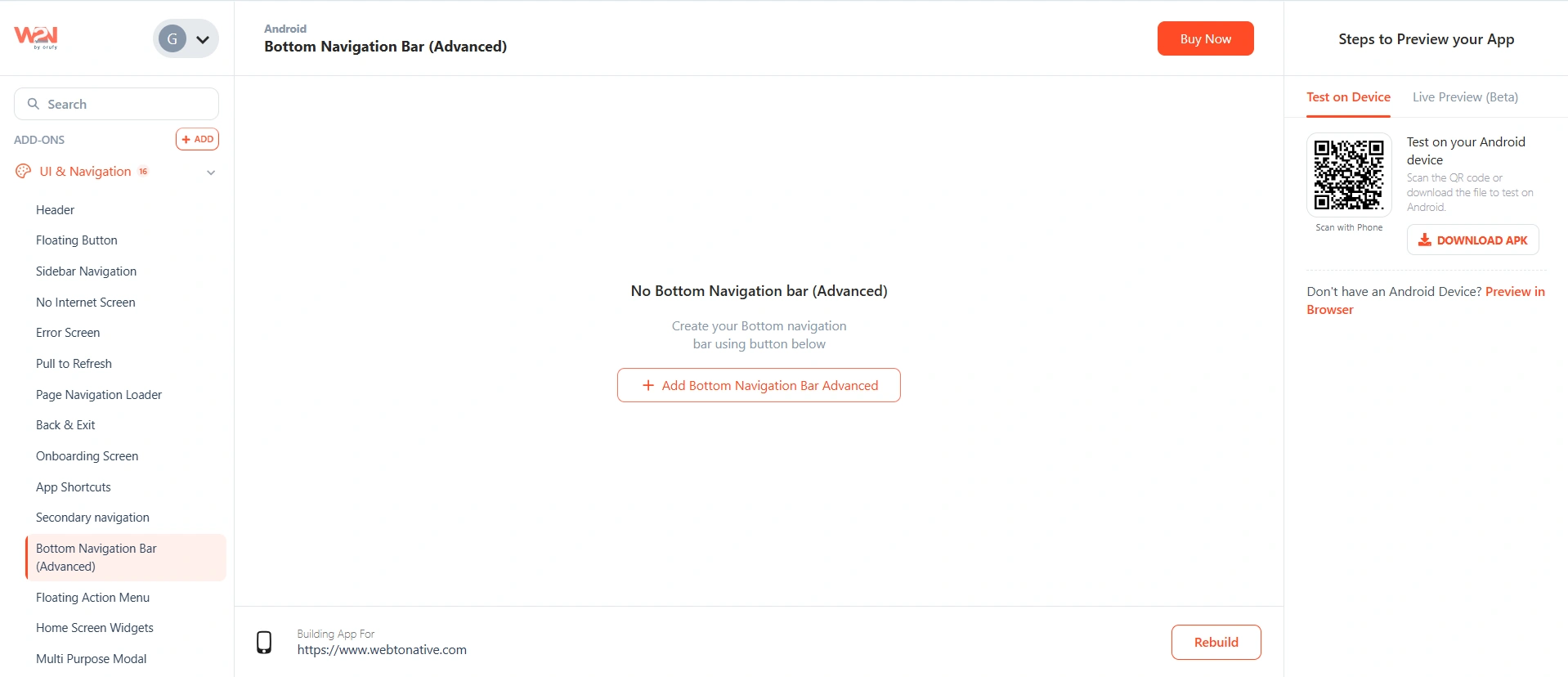
Add Bottom Navigation Bar
Click Add Bottom Navigation Bar Advanced to open the configuration panel. The Advanced version gives you full control over templates, floating buttons, expandable menus, and appearance.
Choose a template
Pick a starting template that matches your app's visual style (Dark or Light). You can customize everything after — the template just sets the initial look.
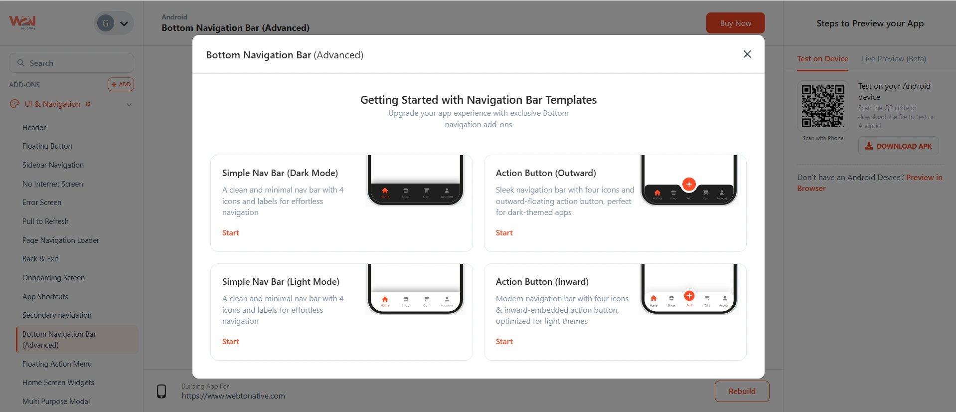
Inward — the floating button sits flush inside the nav bar with a notch cut into it. Outward — the floating button rises above the nav bar for more visual prominence. Both positions can be changed after setup.
Add icons and links
Configure each tab in the navigation bar — the icon, its label, and where it takes the user when tapped. Choose icons from five built-in libraries:
- Font Awesome
- Material Icons
- Lucide Icons
- Phosphor Icons
- Remix Icon
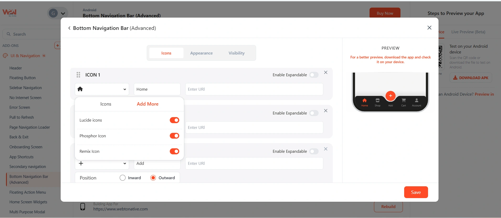
Stick to one icon library throughout your navigation bar. Mixing styles (e.g. Font Awesome filled icons alongside Lucide outlines) creates visual inconsistency that users notice even if they can't articulate why.
Enable Expandable menu
The expandable menu lets you add extra destinations that don't need permanent space in the navigation bar. When a user taps the expandable trigger, a sub-menu appears with additional icon links — keeping the bar clean while still making more sections reachable.
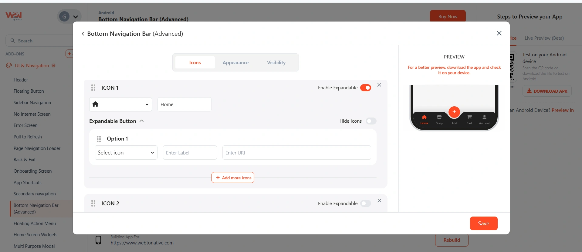
The navigation bar supports a maximum of 5 items total (including the floating button if you have one). Use the expandable menu for any secondary destinations beyond that limit — for example, Settings, Help, or infrequently visited sections.
Configure the Floating Button
The floating button is the central circular button — typically used for your app's primary action (create a post, start a scan, open a chat, add an item). It's more prominent than regular tabs and draws the eye immediately.
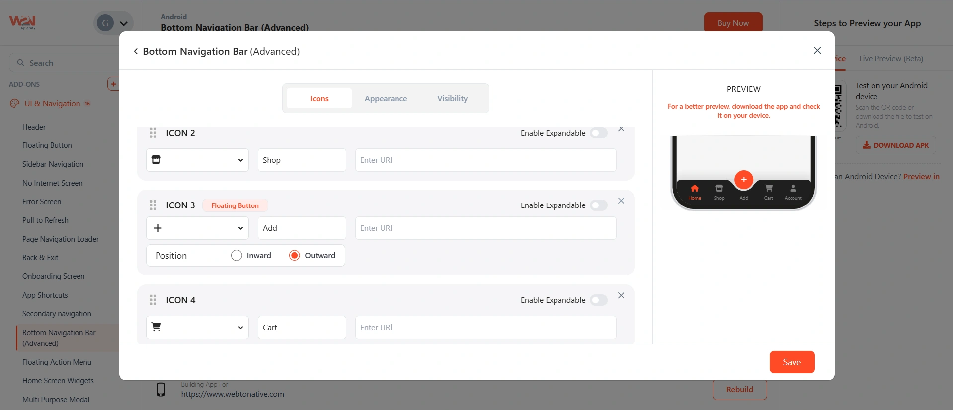
⬇️ Inward The button sits flush inside the nav bar. The bar shows a curved notch around it — giving a sleek, integrated look. Common in e-commerce and productivity apps.
⬆️ Outward The button rises above the nav bar for maximum visibility. Hard to miss — ideal when the action is the most important thing users do in your app.
You can reorder the floating button's position within the bar using the drag handle on the left side of each item row.
Navigation bar appearance
Control how the nav bar itself looks — its background, corners, and shadow.
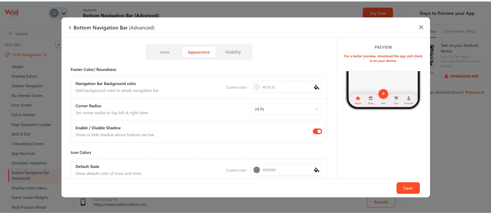

Background Color
The fill color of the entire navigation bar. Use your app's background or surface color — typically white, dark gray, or your brand color.
Corner Radius
Rounds the top-left and top-right corners of the nav bar where it meets the screen content. A small radius (8–12px) gives a soft, floating feel. 0 means flat, edge-to-edge corners.

Enable / Disable Shadow
Adds a subtle drop shadow above the navigation bar — visually separating it from the page content below. Recommended when the page background color is similar to the nav bar color.
Set Icon Colors
Control the color of navigation icons in their two states — when idle and when the user is on that tab.
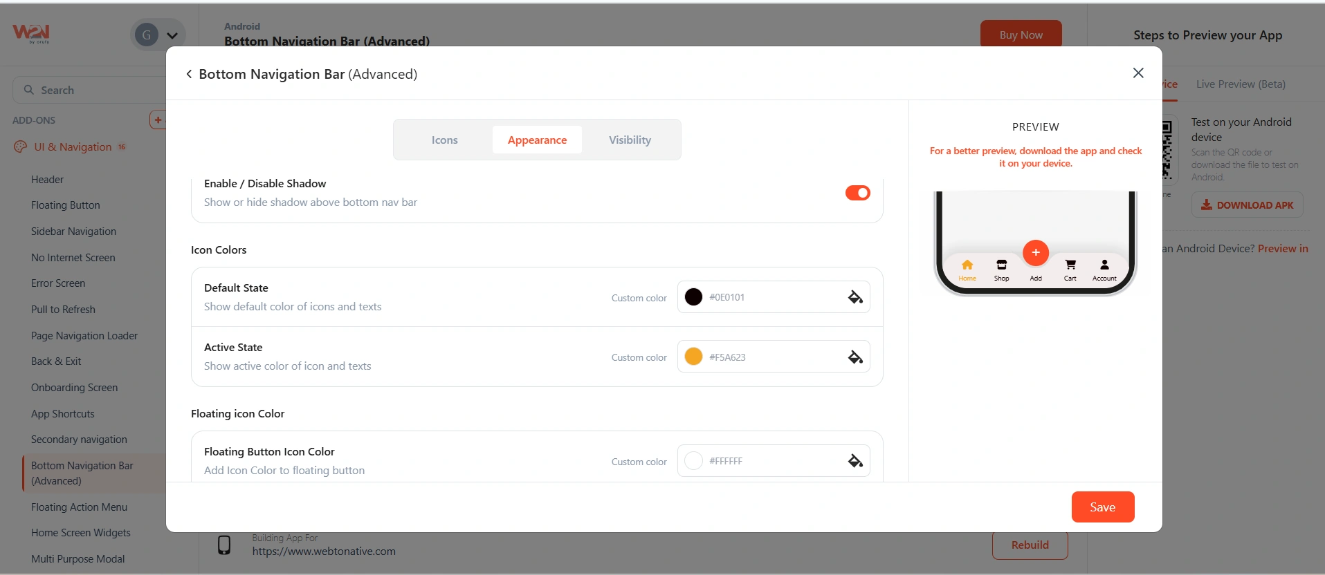
Default State Color
The color of icons when the tab is not selected. Typically a muted gray or low-opacity version of your brand color — visually subordinate to the active tab.
Active State Color
The color of the icon and label when that tab is currently selected. Use your primary brand color so the active section is immediately obvious to users.
Make the contrast between Default and Active states strong enough to be unmistakable — especially for users with visual impairments. A good rule: the active icon should be at least 3× more visually prominent than the inactive ones.
Set floating button colors
Style the floating action button independently from the regular navigation icons.
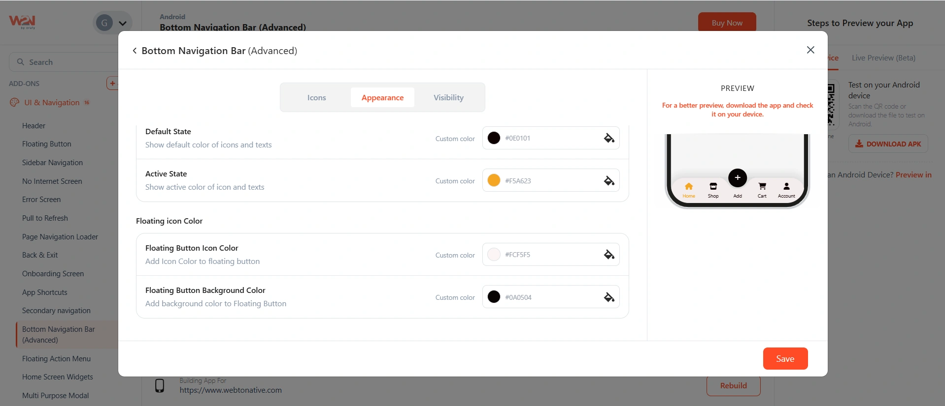
Floating Button Icon Color
The color of the icon displayed inside the floating button — usually white for contrast against a colored background.
Floating Button Background Color
The fill color of the circular button itself. Use your primary brand color or a contrasting accent to make the button stand out from everything else on screen.
Page Visibility
Choose which pages in your app display the bottom navigation bar. You can add multiple URL rules, and you can configure different navigation bars for different sections.
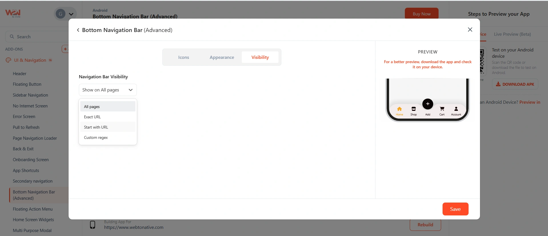
All Pages
The nav bar appears everywhere. Use this for global navigation that applies to the entire app experience. Note: selecting All Pages means you cannot add a second, separate navigation bar — use the expandable menu for extra items instead. _ example.com
Exact URL
The nav bar appears only when the user is on this exact URL. Useful for a custom navigation experience on a landing page or checkout page. _ example.com/product/shoes
Start with URL
Any page whose URL begins with the specified prefix shows the nav bar. Use for section-specific navigation — for example, a different set of tabs inside a blog or store section. You can add multiple Start with URL rules. _ example.com/product
Custom Regex
Write a regular expression to match exactly the pages you want. For developers who need precise control beyond URL prefixes. _ (example.com/login/*)
Save and rebuild
Click Save then Save & Rebuild. After installing the updated build, the bottom navigation bar appears on all pages matching your visibility settings.
Test every tab to confirm it navigates to the correct URL. Check both the Default and Active icon colors on a real device — colors can look different on screen than in the dashboard color picker.
Show and hide the navigation bar with JavaScript
If you set visibility to All Pages but need to hide the nav bar on specific pages — like a full-screen video, an immersive onboarding flow, or a checkout screen — call the hide function from that page's JavaScript. https://docs.webtonative.com/javascript-apis/native-controls-and-js-bridge-functions (opens in a new tab)
Best practices for bottom navigation design
Use 3–5 tabs — not fewer, not more
Fewer than 3 tabs don't justify a persistent bar. More than 5 overwhelms users and makes each icon too small to tap accurately. 4–5 is the sweet spot for most apps.

Keep labels to 1–2 words
Tab labels should be concise enough to read at a glance. "Home," "Orders," "Account" — not "My Account Settings" or "View All Orders."
Don't put destructive actions
Delete, sign out, and cancel don't belong in bottom navigation. The nav bar is for primary destinations — places users want to visit regularly, not actions they take occasionally.

Make the active state unmistakable
The active tab should be clearly different from inactive ones — in color, weight, or both. Users rely on this to stay oriented. A subtle difference is not enough on a real device screen.

Keep one primary action
The floating button should represent the single most important action in your app. One action — not a menu. If you have multiple important actions, use regular tabs or the expandable menu instead
Stick to one icon library
Choose one of the five available libraries and use it consistently across all tabs. Mixing icon styles from different libraries creates visual inconsistency that makes the bar look unpolished.
Frequently Asked Questions
Can I add a floating button if I select the Simple template?
Yes — the template only sets the starting appearance. After selecting Simple (Light or Dark), you can use Add More within the configuration to add a floating button or enable the expandable menu. You're not locked into the template's original structure.
Can I reorder the icons and floating button?
Yes — every item in the navigation bar has a drag handle on its left side. Drag any icon or the floating button to reorder it within the bar. The floating button can be placed at any position — left, center, or right.
How many icons and buttons can I add?
The navigation bar holds a maximum of 5 items total — including any floating button. Only one floating button is allowed. If you need more destinations, add them to the Expandable menu, which appears as a sub-menu when the user taps the expand trigger and has no strict item limit.
Can I have different navigation bars for different sections of my app?
Yes — you can create multiple bottom navigation bars and assign each one to different pages using URL rules. For example: one navigation bar for your store section (using Start with URL: /shop) and a different one for your blog section (Start with URL: /blog). The only restriction is if you set a navigation bar to All Pages — in that case you cannot add a second bar, since the first already covers every page.
What is the expandable menu and when should I use it?
The expandable menu is a hidden sub-menu that slides up or expands when the user taps the designated trigger icon in the nav bar. Use it for secondary destinations that don't need permanent visibility — Settings, Help Center, Account Info, or any section users visit occasionally rather than frequently. It keeps the main nav bar clean (3–5 core destinations) while still making additional sections accessible.