


Advanced Bottom Navigation
The Advanced Bottom Navigation Bar provides a highly customizable user interface that enables users to access options quickly within your app.
- Expandable Menu Elements: It offers more features without crowding the navigation bar. - Icon and Image Support: Add custom icons or upload images of icons for an immersive look. - Inward and Outward Customisation: It allows you to change the position to inward or outward of the floating button icon, the background colour of the button, and the icon colour.
Here is the step-by-step procedure to advance your bottom navigation tab.
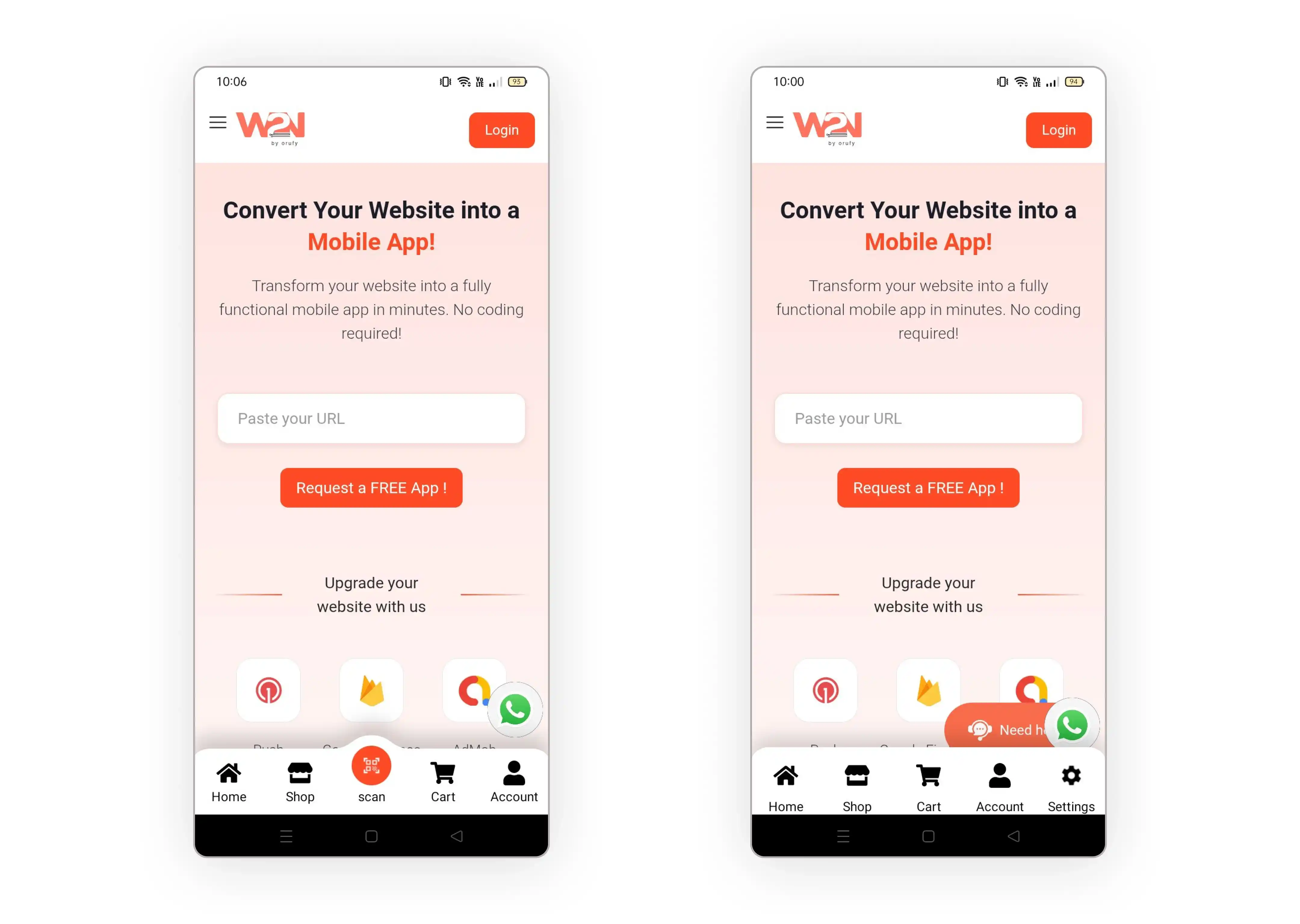
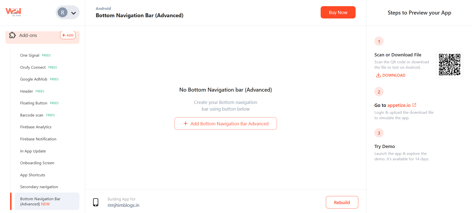
1. Bottom Navigational Tab From the Add-Ons menu, click on the Advanced Bottom Navigational Tab to add a bottom navigational tab to your app to move further.
2. Add Bottom Navigational Tab Now, click on “Add Bottom Navigational Bar Advanced” to add the bottom navigational tab.
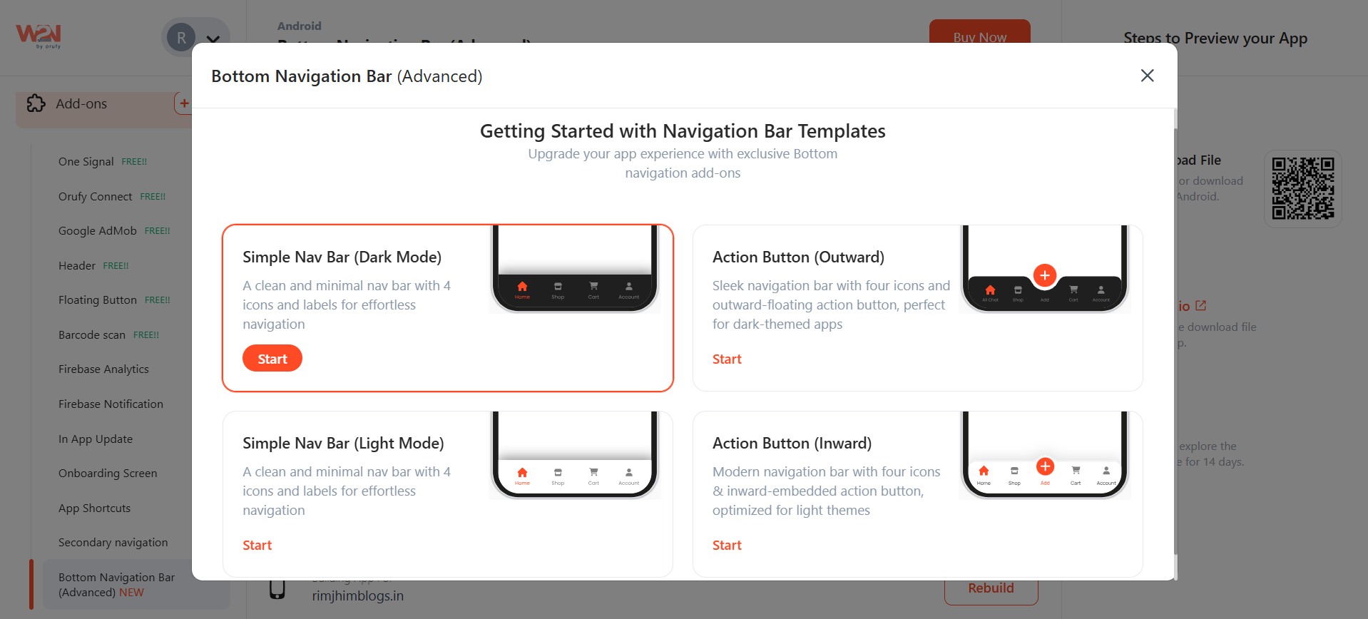
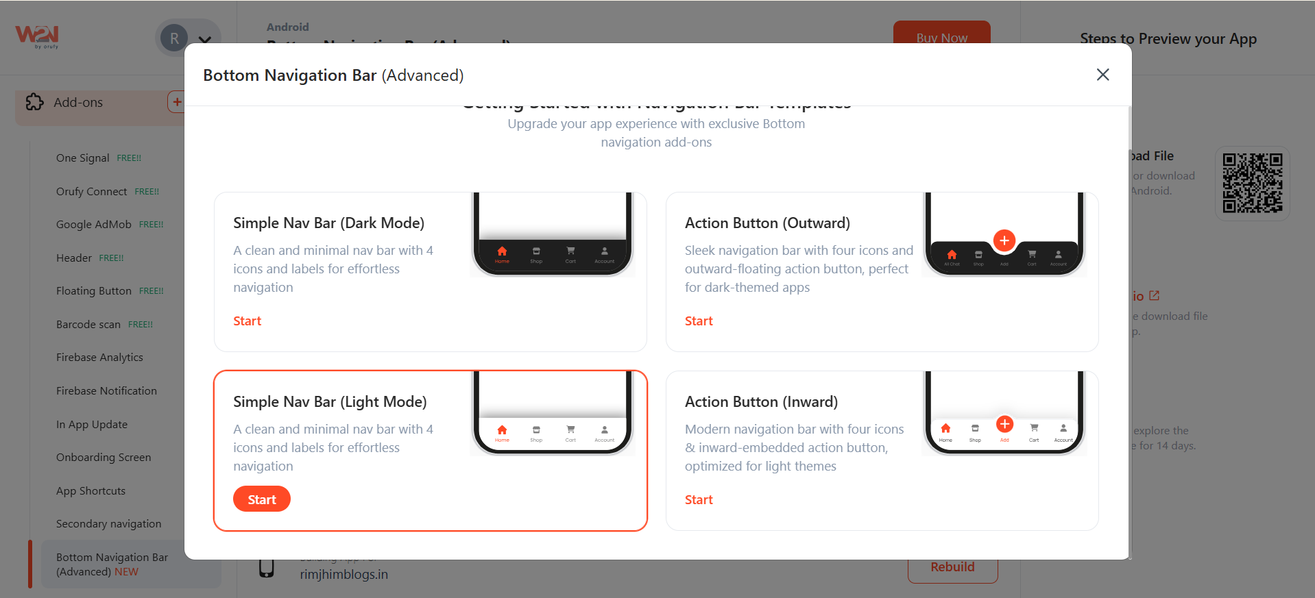
3. Select the type of Navigation Bar Template
- Navigation Bar (Dark Mode): This template features a bottom navigation bar in dark mode, complete with up to 5 icons and labels, making it easier to access sections within the app.
- Action Button (Outward): This template features in a dark-theme navigation bar with four icons and a floating action button. The floating action button is positioned outward, making it stand out visually to highlight a specific section in the app’s navigation bar.
- Simple Navigation Bar (Light Mode): This template provides a minimal and sleek bottom navigation bar in light mode with up to 5 icons with labels.
- Action Button (Inward): This light-mode template with an inward floating action button that blends in the navigation bar gives a balanced look, enhancing the app’s functionality by catching the user’s attention at one glance.
For Example If you have selected Simple Navigation Bar (Light Mode). Let’s see what all you have to do.
1. As you click on Start.
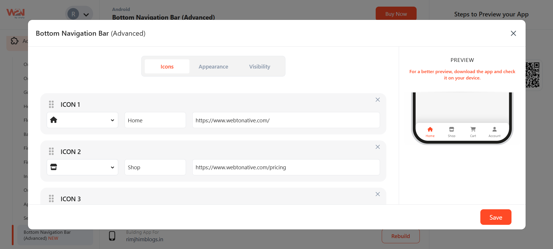
2. A pop-up will appear asking you to fill in the desired icons with labels and their respective URLs. You can add up to 5 icons in the bottom navigational bar.
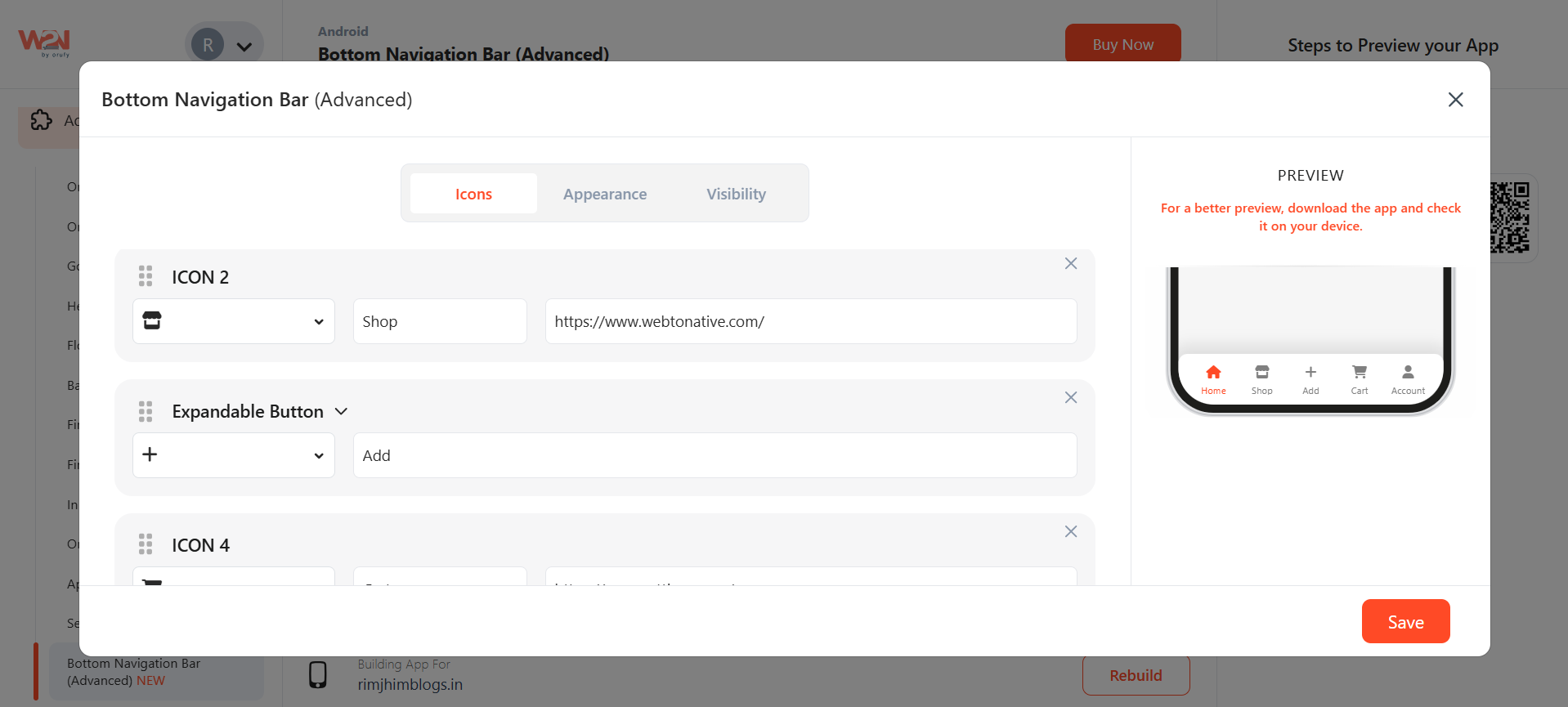
3. As you click on “+ Add More”, you can add icons, an expandable menu or a floating button. One of the five icons can be:
- An Icon: This is an ordinary icon, similar to the four icons in the bottom navigation bar.
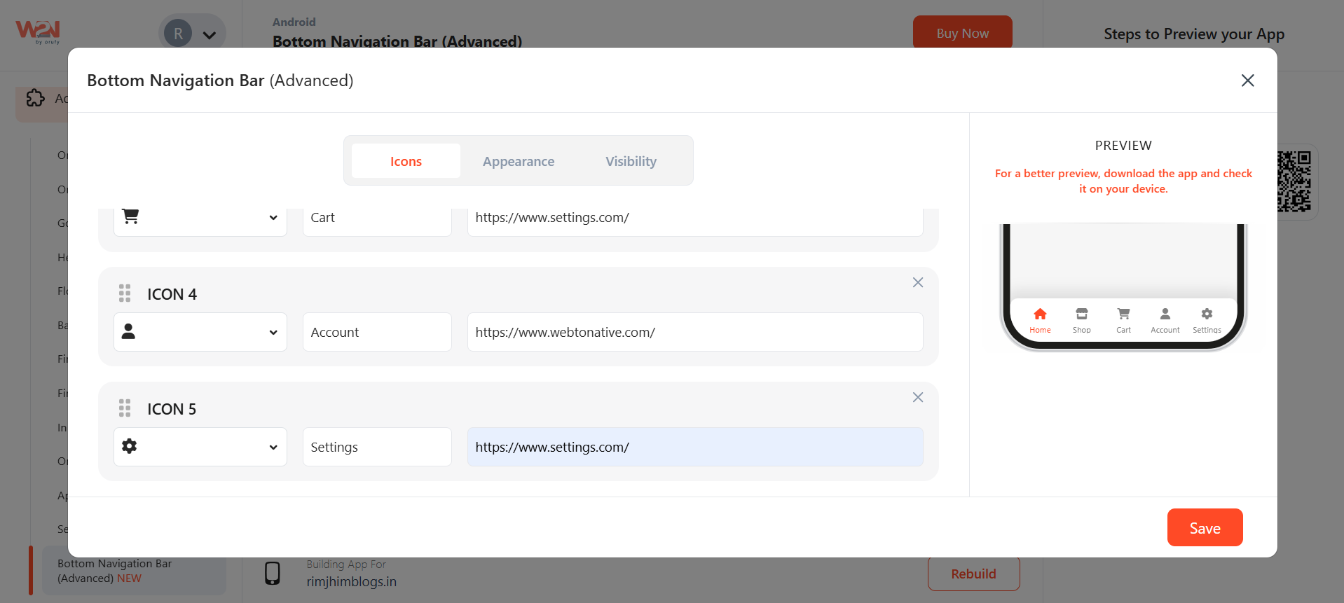
- An Expandable menu: Insert an icon that can be expanded in the form of a list.
- Floating Button: This is an engaging button in the app that can be positioned outward or inward in the bottom navigation bar, merging effortlessly within the bar.
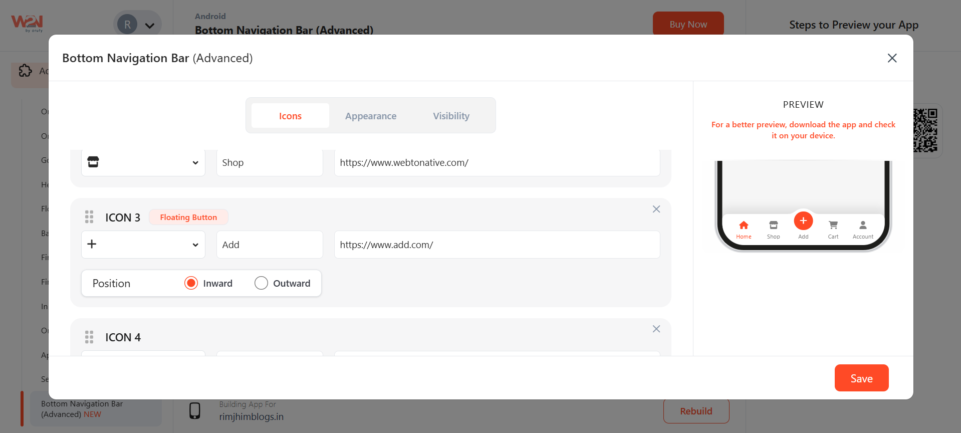
4. There are three sections: Icons, Appearance, and Visibility. In the First Icons section, select the icons you want to add and label the icons with their desired URL. In mind that the URL is working because as soon as the user clicks on the icon, they will be redirected to the given URL.
5. The second section is Appearance. Colour/Roundness
- Navigation bar background colour: Add background colour to the full navigation bar.
- Corner Radius: Set the corner radius or edges of the navigation bar from both sides, left and right.
- Enable/ Disable Shadow: Show or hide shadow on the above navigation bar.
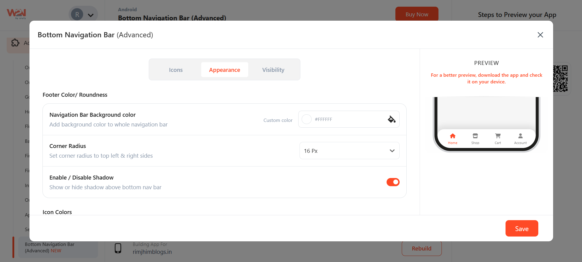
- Icon Colors - Default state: Default colours of the icons, and you can change them as per your requirements. **- Active state:**The active state is when you are shop page, the icon colour turns orange, referring to your current page.
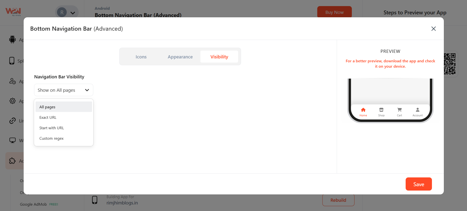
6. The third section is Visibility. - All pages: Bar visible on all pages of the app - URL: viewed on the entered URL - Start with URL: the start URL is added to all pages after opening. - Custom Regex: Custom regex allows developers to set flexible rules for when a navigation item should appear active, instead of relying only on exact URL matches.
Now, Save the changes made in your app. Rebuild to make them reflect in your app.
NOTE: For a more precise view, create your custom bottom navigational bar and install it on your device.