


Header
Add a balanced and customizable header to your mobile app, enhancing navigation and user experience. Select from multiple header template simple header, side logo header, or floating headers available in both light and dark modes. Designed to create a visually appealing look with flexible header templates for your app requirements. Here is the step-by-step procedure to customize your header navigation.
1. Header Navigation From the Add-Ons menu, click on the Header to add a header navigation to your app to move further.
2. Add Header Navigation Now, click on “+ Add Header” to add the header navigation.
3. Select the Header template Select the header template which you want to reflect in your app’s header. There are 6 types of header templates:
1. Simple Header (Dark Mode) 2. Simple Header (Light Mode) 3. Side Logo Header (Dark Mode) 4. Floating Header (Dark Mode) 5. Right Side Logo Header (Dark Mode) 6. Header with Logo Search
For Example
1. Simple Header (Dark Mode) Click on Start to customize your Simple Header. In this header template, there are three sections icons, appearance and visibility.
- The first section is Icons. This section includes icons, logo, text, icons and text, expandable icons and back button with full customization as per required. Keep in mind you can icons as per your requirement but after adding 5 icons the rest icons will not be visible.
- The second section is Appearance. This section includes header colors, logo position, icon colcor, border radius and many more. 1. Header
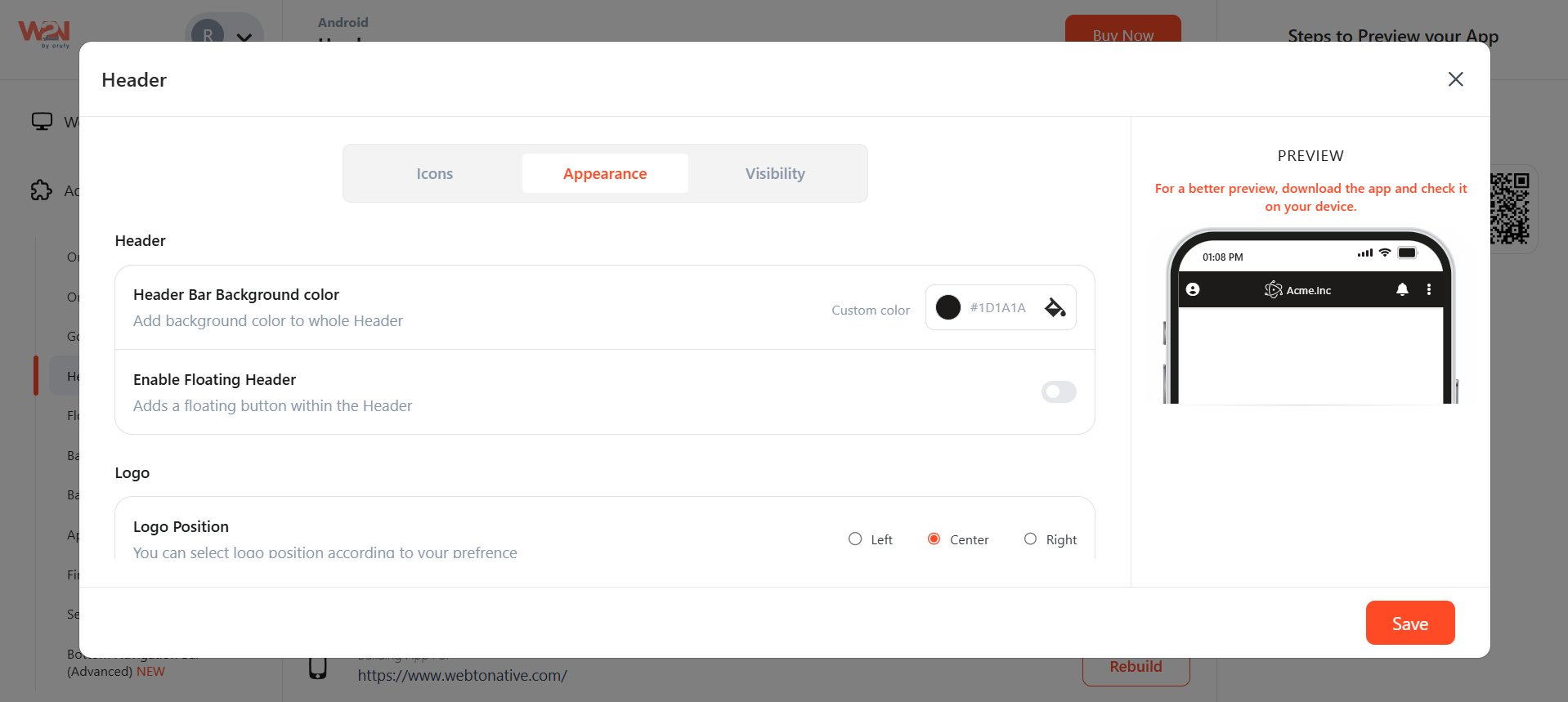
- Header Bar Background Color - Add the background color to complete header.
- Enable Floating Store - It allows it to stay visible while the user is scrolling. If you enable it, customize header style, to space and side space of the header.
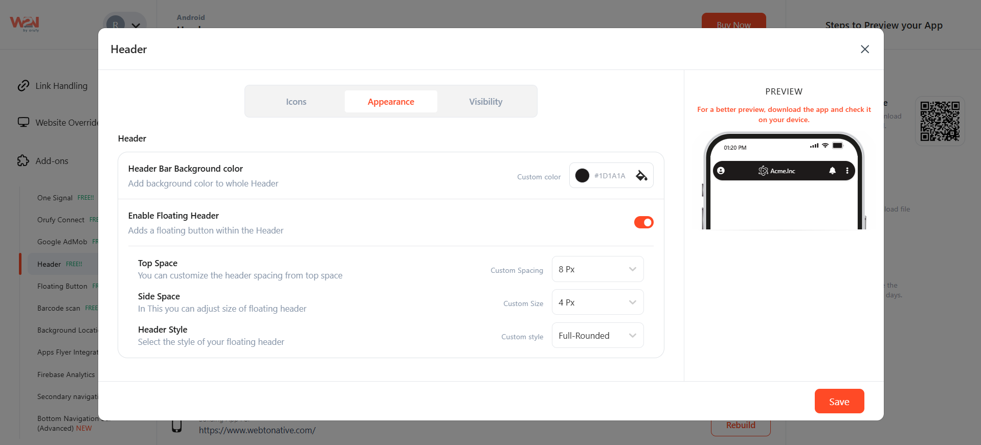
2. Logo
- Logo Postion- Select the position of your logo to be on left, right, center.
- Logo Color- change the color of your logo as per your business.
- Do You Wish to override - You can change the existing settings with new customizsed preferences.
3. Icon Header
- Icons Background colour: Add background color to fi\ull header navigation bar.
- Icons color: Add the color to your icons
- Border Radius: set the corner radius for the icons
- Stroke: add the outline. And the color of the stroke means
- The third section is Visibility. 1. All pages: Bar visible on all pages of the app 2. URL: viewed on the entered URL 3. Start with URL: the start URL is added to all pages after opening. 4. Custom Regex: Custom regex allows developers to set flexible rules for when a navigation item should appear active, instead of relying only on exact URL matches.
Now, Save the changes made in your app. Rebuild to make them reflect in your app. NOTE: For a more precise view, create your custom bottom navigational bar and install it on your device.