


Floating Action Menu
Think of the Floating Action Menu as a persistent shortcut button that floats above your app content at all times. It sits quietly in the corner until the user needs it — then a single tap expands it into a vertical list of quick actions, each with its own icon, label, and destination URL.
You'll recognise this pattern from Gmail (the compose button), Google Maps (directions, save, share), and most productivity apps. It's the most reachable spot on a large-screen phone — perfectly placed for the thumb without covering main content.
This add-on is available for both Android and iOS. You can start with the Starter plan to access this Add-on for free on Webtonative.
Why use a Floating Action Menu?
Optimal thumb reach
Positioned at the bottom-right corner, it sits exactly where the thumb naturally rests on a large modern phone — actions available without any hand shift.
Declutters the interface
Multiple quick actions — "Add Photo," "Create Document," "Upload File" — live in one expandable menu instead of taking up slots in the header or navigation bar.
Distraction-free Reading
Separates active actions (create, share, compose) from passive content viewing. Users can scroll and read without interface elements competing for attention.
Best Practices to Configure Floating Action Menu
High-frequency actions
Use the FAM for creative or constructive tasks — "Create," "Share," "Compose. only" Not for navigation or destructive actions like delete.
Keep it to 4–6 buttons
Fewer than 4 options don't justify the menu pattern. More than 6 defeats the purpose of a clean UI. Stay in that range.

Main button Focus
Use a bright brand colour, an elevated shadow, and a clear icon (+ or ≡), so users immediately understand the button's purpose without a label.
Where to Find It In Your Dashboard
My Apps ➡️ Edit your app ➡️ Add-ons ➡️ Ui & Navigation ➡️ Floating Action Menu
Steps to apply the Floating Action Menu to your app with WebToNative
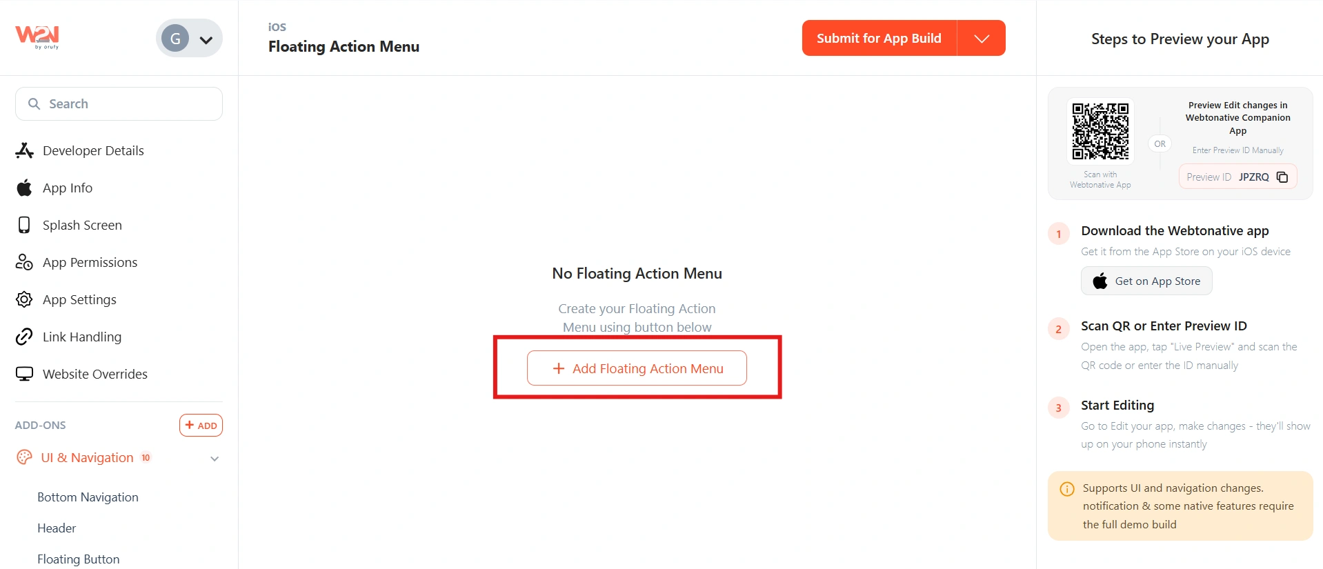
Create your Floating Action Menu
Click Add Floating Action Menu to start building your menu. This opens the configuration flow where you'll set up all the steps below.
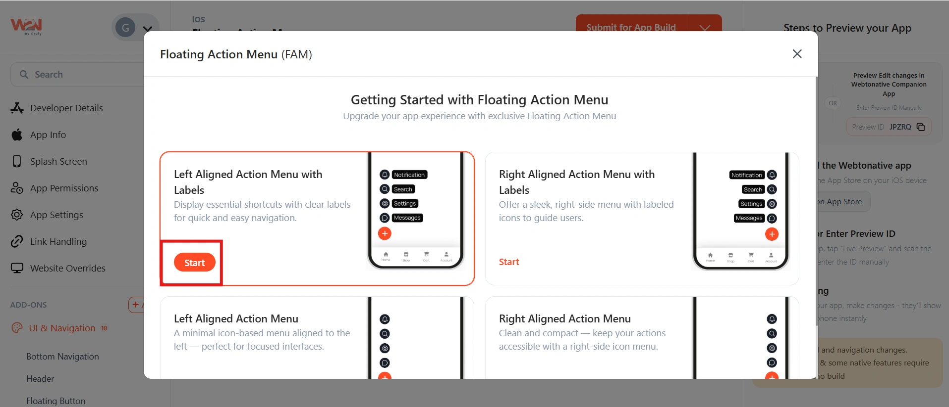
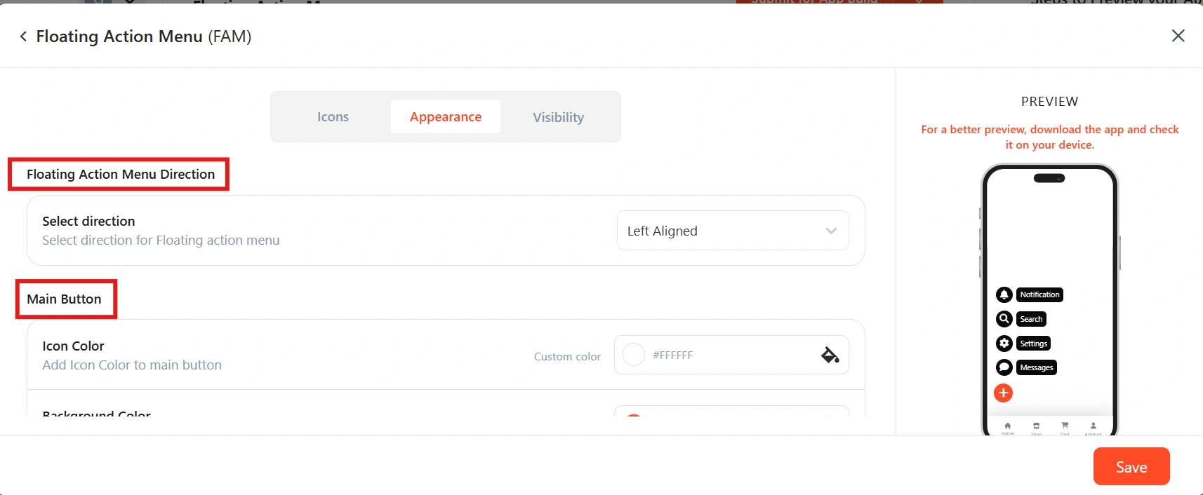
Alignment and label style
Select how you want the menu positioned and whether action labels are visible. Two options:
⬅️ Left-aligned: Menu and all buttons appear on the left side of the screen. Choose with or without text labels next to each icon.
➡️ Right-aligned: Menu and all buttons appear on the right side. Standard position for most apps — matches thumb reach for right-handed users.
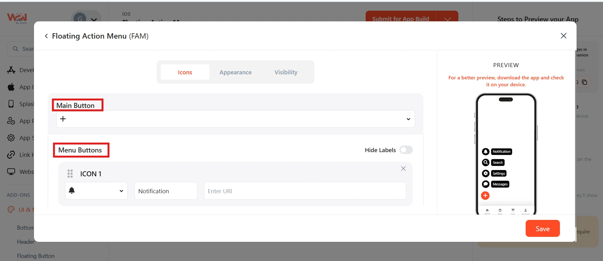
Icons and menu buttons
Set up the main button icon and each menu action button.
Main Button Icon
Choose the icon for the central button that users tap to expand the menu.
Menu Button Icon
Choose the icon for each action button in the expanded menu. Each button gets its own icon selected from the built-in library.
Menu Button URL
The page the user is taken to when they tap this action button. Enter the full URL including https:// — it should point to a page within your app's website.
Menu Button Label
The text label shown next to each action button. Keep labels short and action-oriented — "Share", "Add", "Upload", "Contact." Max 15 characters recommended.
Set the appearance
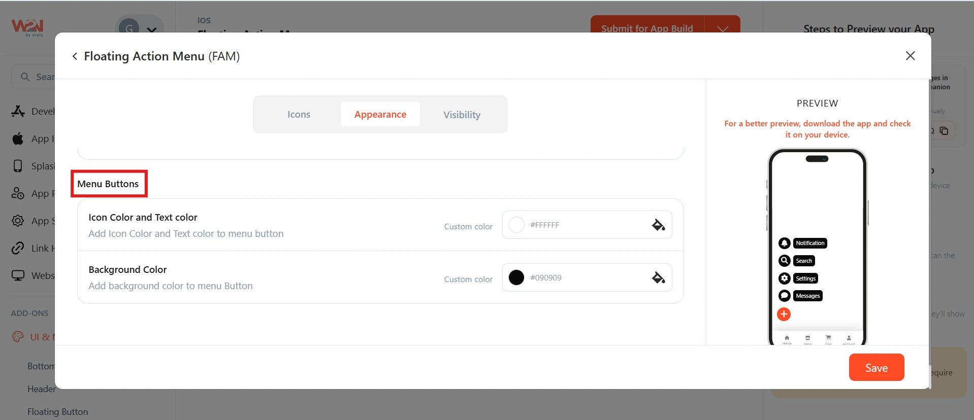
Control how the menu appears on screen — including alignment (left or right), opening direction, and the colors of both buttons.
Main Button
Set the color of the icon inside the main circular button and the background color of the button itself. Use your primary brand color so it stands out clearly against the page content.
Menu Buttons
Set the icon color for each expanded action button, as well as the background color of the smaller action buttons. Using a slightly lighter shade of the main button color creates a clear visual hierarchy.
Set page visibility
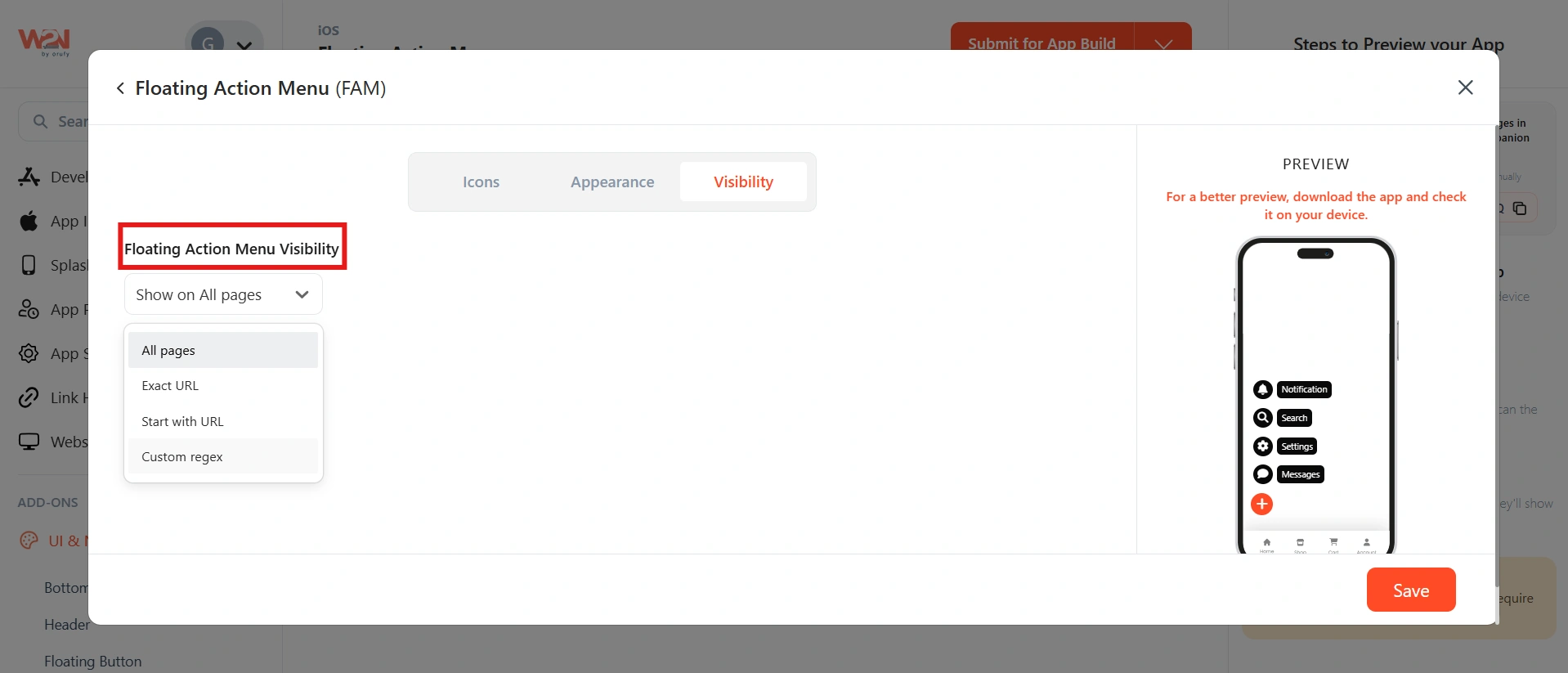
Choose which pages the Floating Action Menu appears on.
All Pages
The menu floats on every page. Best for actions that are always useful — like "Contact Us" or "Share Page." EG-www.example.com
Exact URL
The menu appears only on this exact URL — useful for a specific product page, checkout, or landing page where the actions are particularly relevant. EG - www.example.com/comparison/abc
Start with URL
Any page whose URL begins with your chosen prefix gets the menu. Use this to show it across an entire blog, category, or account section. EG- www.example.com/blog → covers /blog, /blog/post-1, /blog/tags.
Custom Regex
Write a regular expression to match exactly the pages you want. For developers who need precise control over which URLs display the menu. EG - ^https://www\.example\.com/(shop|products)*.
Save and rebuild
Click Save, then click Save & Rebuild in the main dashboard. After installing the updated build, the Floating Action Menu will appear on the pages you selected.
To test: open a page in your app that matches your visibility settings. The floating button should appear in the corner. Tap it to confirm the menu expands and each action navigates to the correct URL.
If you set visibility to All Pages but want to hide the menu on specific pages — like a checkout flow or a full-screen media page — you can call a JavaScript function directly from that page's code. https://docs.webtonative.com/javascript-apis/native-controls-and-js-bridge-functions#id-3.-show-native-components (opens in a new tab)
Frequently Asked Questions:
What are the minimum and maximum numbers of menu buttons?
You must add a minimum of 4 menu buttons. The recommended maximum is 6. Fewer than 4 doesn't justify using a collapsible menu pattern; more than 6 makes the expanded menu visually overwhelming and harder for users to scan.
Can I have different menus on different pages?
Yes, you can create multiple Floating Action Menus, each with its own icons, labels, URLs, and visibility settings. However, if you select All Pages under Page Visibility, you won’t be able to create additional Floating Action Menus for specific pages. To add more menus for different pages, choose any option other than All Pages under Page Visibility. Once you do that, you’ll see the Add Floating Action Menu option again.
Will the floating button cover my page content?
The button floats above the content layer — it doesn't push or rearrange page elements. It only physically covers the small area of the screen it occupies. To avoid blocking important content, consider using right alignment (the most common position) and check that no critical text or CTAs appear in the bottom corner of your pages.
What happens when a user taps a menu button?
The app navigates to the URL you entered for that button in Step 3. The URL should be a page within your app's website — so the navigation stays inside the app. Avoid external URLs unless the intent is to open a link in-app.