


Home Screen Widgets
Home Screen Widgets allow you to add interactive and intuitive widgets to your app’s home screen. WebToNative has a wide range of built-in templates with complete customization from text to icons.
You can add multiple widgets to your app’s home screen with their own size, design, and customizations.
This add-on is included free with your Business plan on Android and iOS, and you can unlock it from your Pro plan on Subscription Basis.
Navigate to Add-Ons → Others → Home Screen Widgets
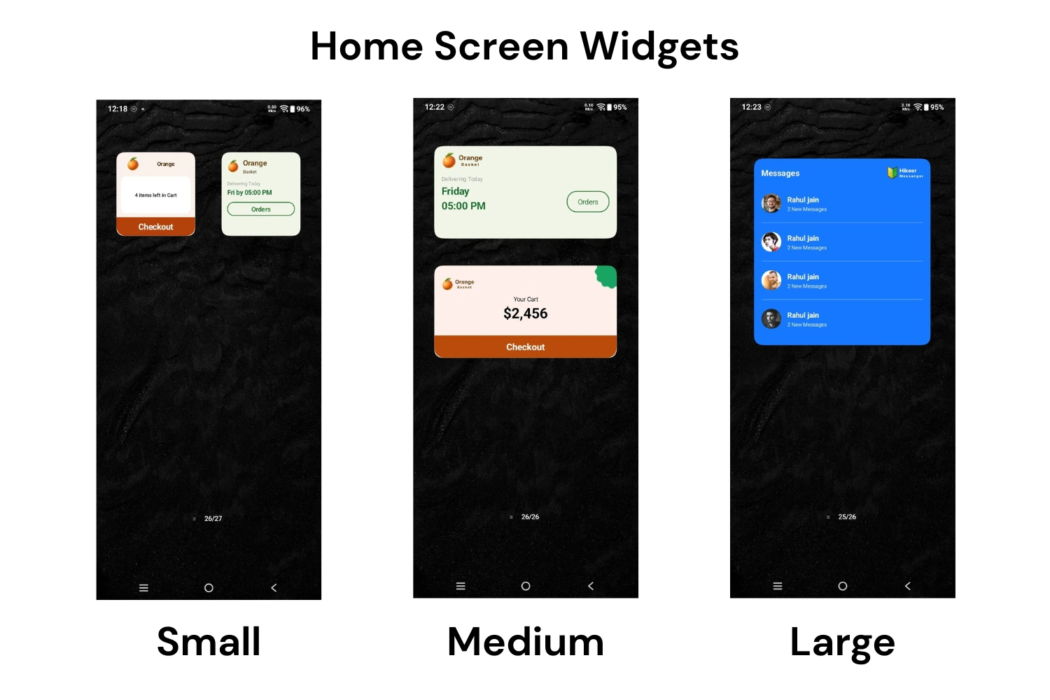
Small Widgets
Shows one essential insight or action at a glance, such as cart total or delivery time. Takes up minimal home screen space, so users can place multiple widgets together.
Medium Widgets
Fits a product preview with a price, discount, action grids, or delivery status with more context. Balances content and branding without feeling crowded.
Large Widgets
Built for dashboard-style views such as a complete sales breakdown, a navigation-style menu, or a message listing. It is ideal when a widget needs to show several data points at once.
Step-By-Step Process to Integrate Home Screen Widgets
Choose a Widget Size
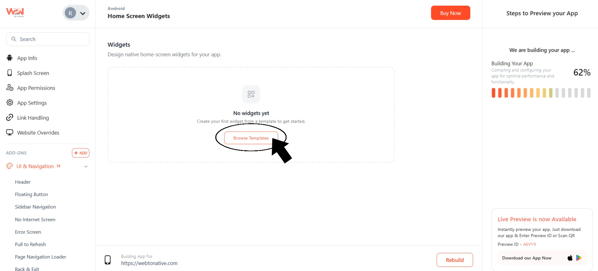
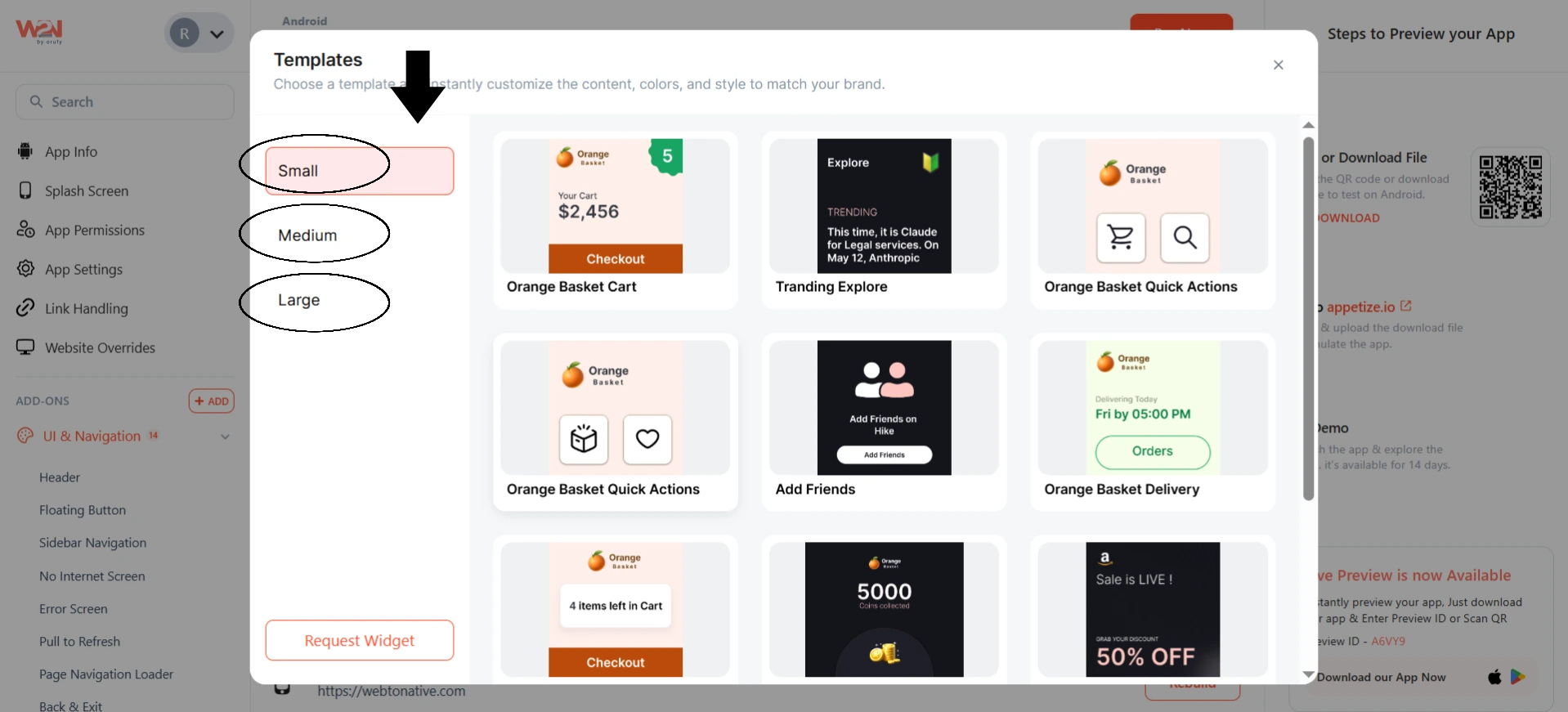
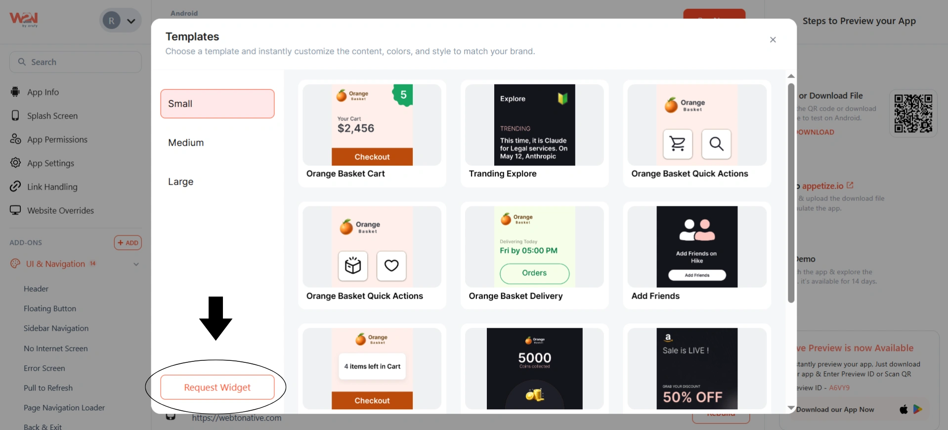
Click on Browse Templates. Select sizes as Small, Medium, and Large.
Pick the Widget Template
Click on the desired template to select it. The templates include an App Update, Orange Basket Cart Items, Weather Widget, Hiker Notification, Banking Widgets, Latest Blogs, and more.
If none of the available templates fit your widget requirements, click on Request Widget to contact the WebToNative support team for further assistance.
Edit Widget Information
Click on the Edit icon from the top left corner. You can edit the name and description of the widget. These two things are used to identify the widget inside the dashboard.
Customize the Widget
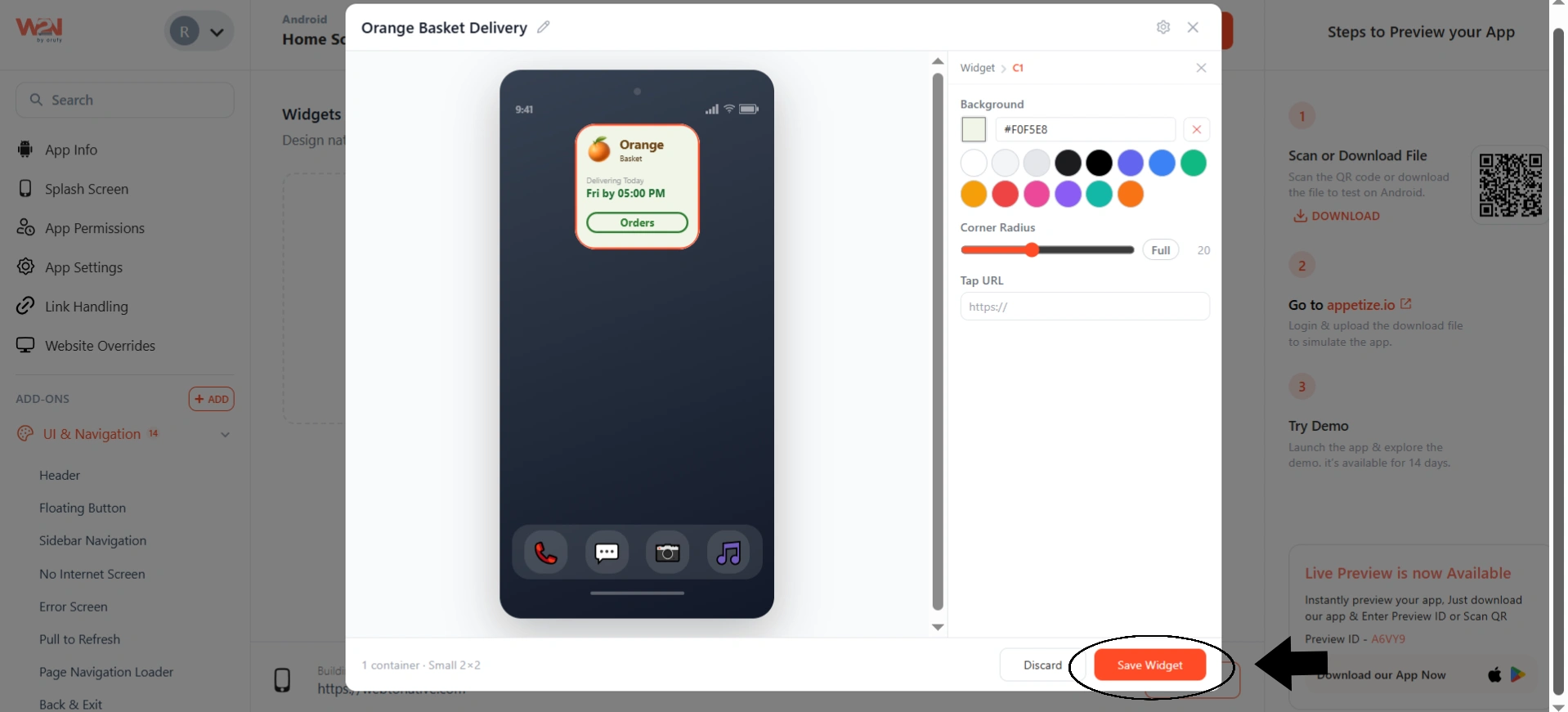
As the widget you selected is opened, tap on the element you want to customize inside the widget. As you start customizing the widget, a live preview is on the left side with a customization panel on the right for each element.
The editor uses a layered structure shown as a breadcrumb at the top, for example Widget > C2 > Inner > Container. Clicking on any part of the widget preview selects that layer so you can edit it directly. The breadcrumb depth changes depending on how the element is nested, for example a text element may show as Widget > C1 > Text or as Widget > C1 > Inner > Text.
You can edit every element inside a widget, including:
1. Content
Click on any text element to change its content. You can set its color to Auto or Custom.
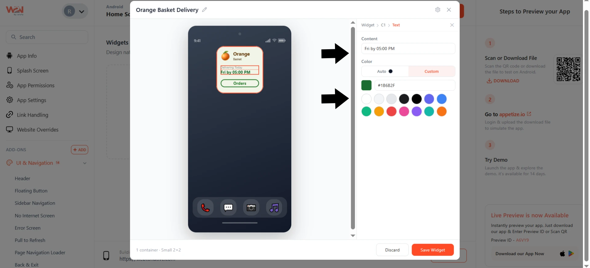
2. Color
You can select a background container color from the color palette or write a hex code. You should also adjust the corner radius for the container.
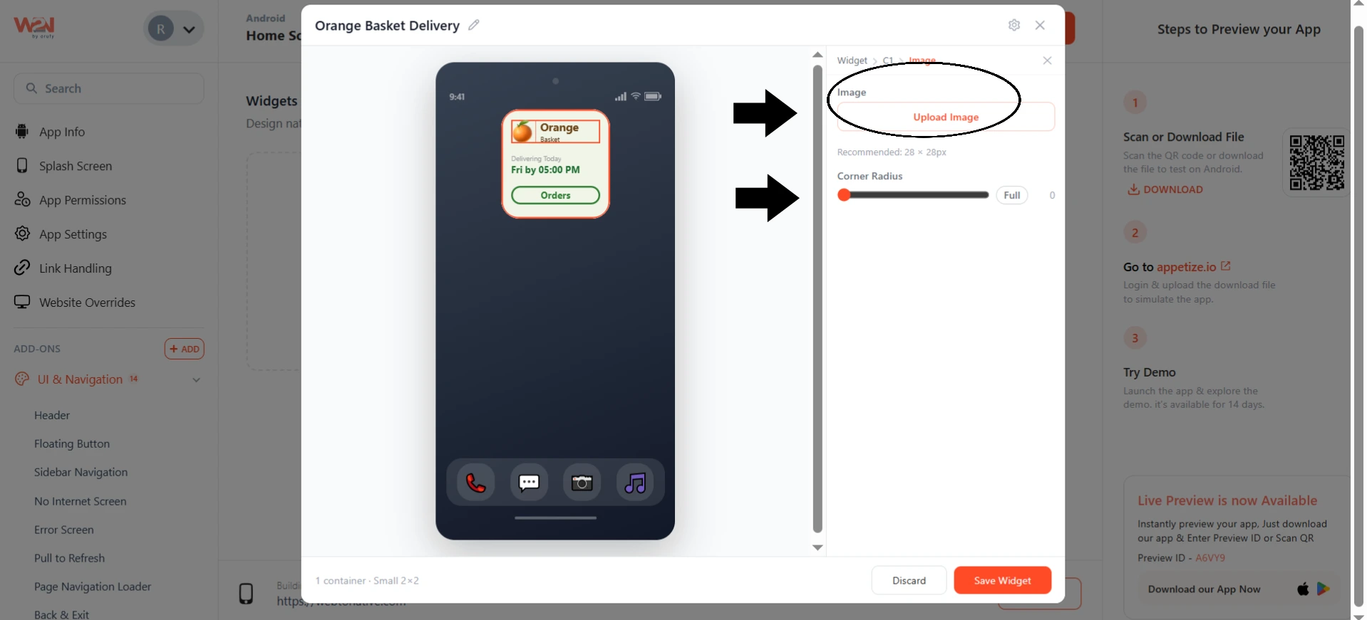
3. Image
You can either replace the default image or upload your specific image from your device.
4. Tap URL
Set where the widget takes the user when tapped. For example, an in-app screen using a scheme like app//:search or an external URL link.
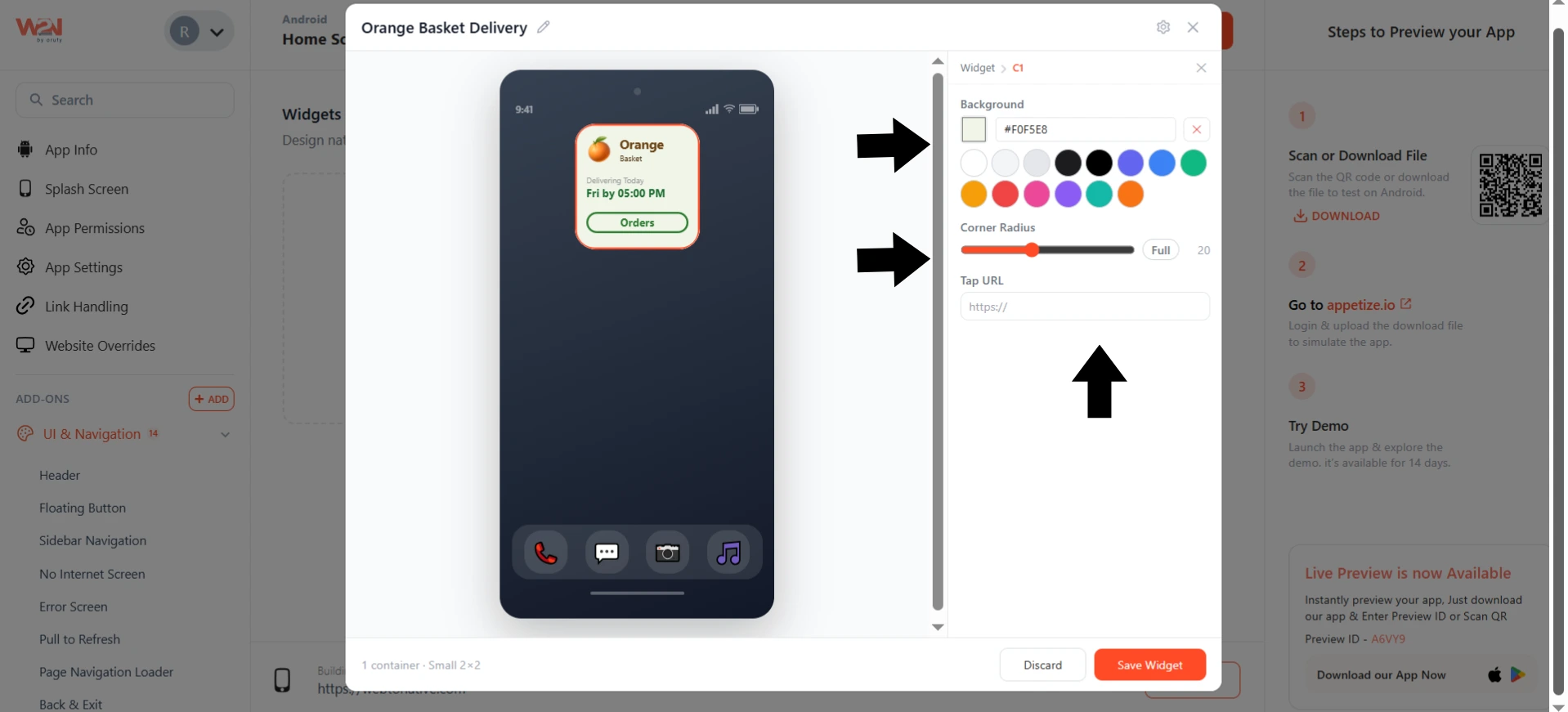
As every layer is selected independently, you can rename any text, customize the color theme, or change the widget destination for each interactive part of the widget.
Click on Save Widget to make it live and save your widget.
Data Sources for Home Screen Widgets
1. Static Source (By Default)
A Static Source is used when you simply want a widget interaction to perform an action inside your app without fetching any data.
For example, suppose you have a chess app that allows users to play against the computer or in multiplayer.
Normally, a user would:
-
Open the app.
-
Tap Play with Computer.
-
Start a new match.
With a Home screen widget, you can create a "Play with Computer" button that launches the app and directly opens a new chess session, skipping the extra steps.
2. API Source
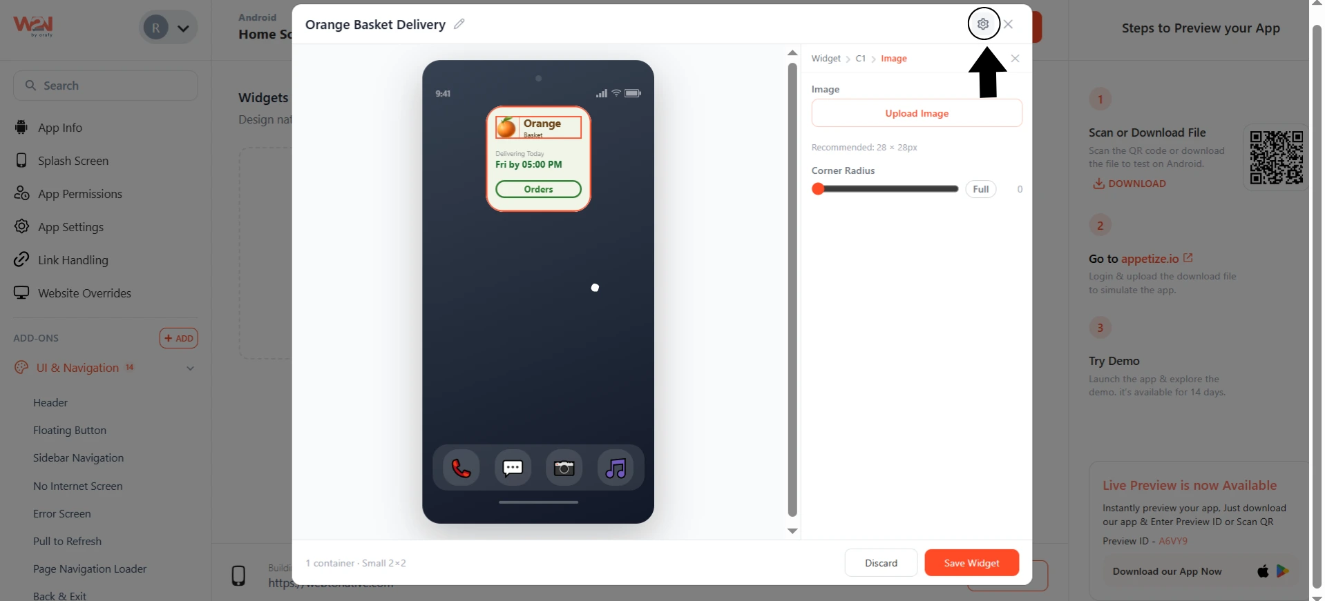
Click on the Settings icon inside the widget editor to configure the API configuration to show the live data inside the widget.
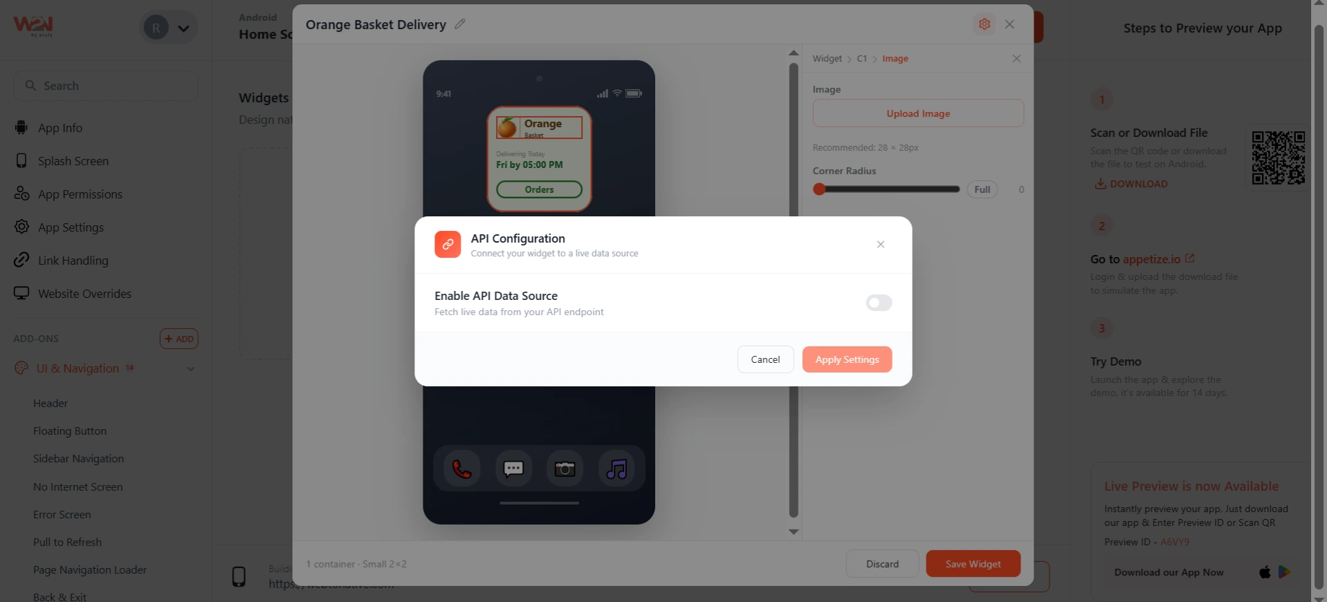
Set the toggle on the Enable API Data Source to allow the widget to fetch live data from your API endpoint.
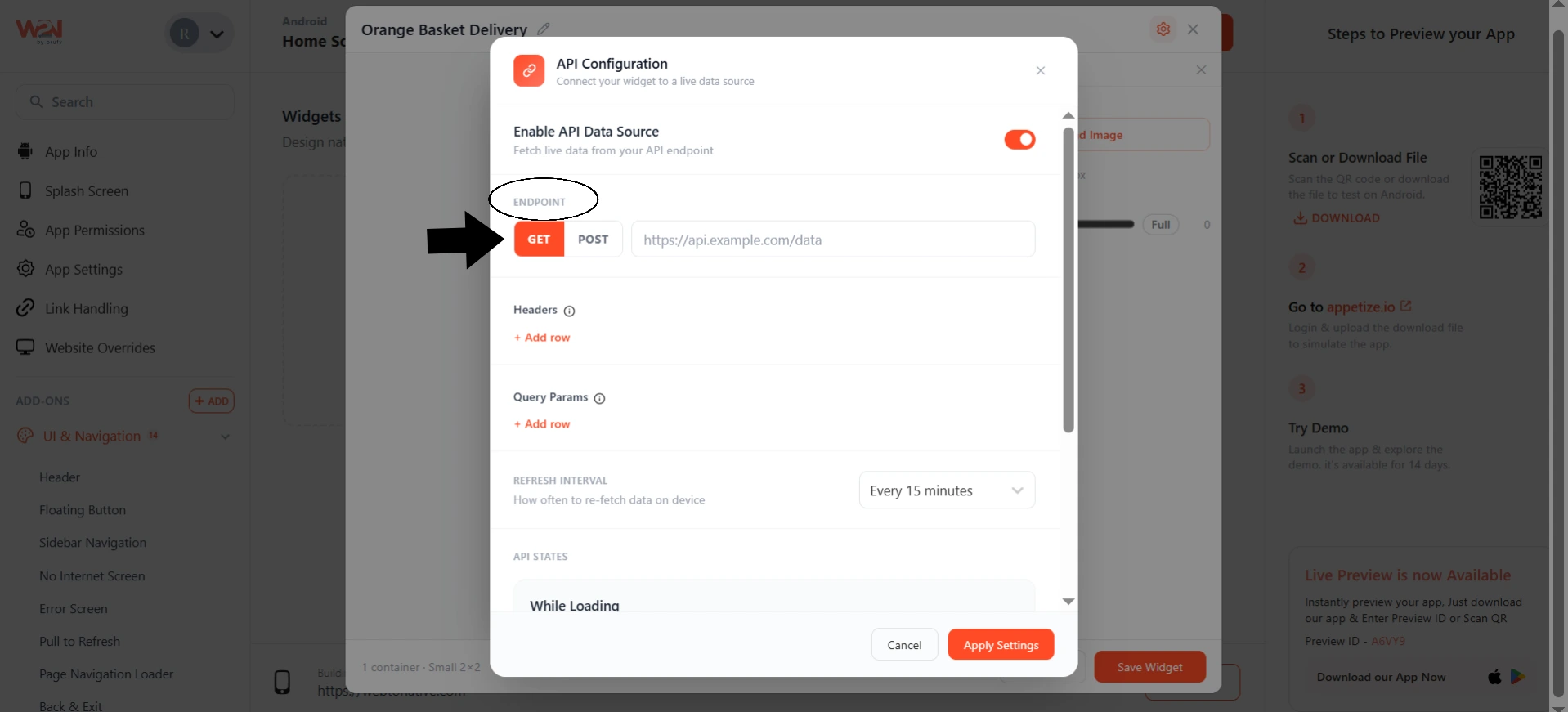
- Under the Endpoint field, choose the GET or POST method. And enter the URL.
Use the GET method when your API only needs to return data without sending any additional information in the request body.
Use the POST method when your API expects data to be sent along with the requests, such as a user ID or filter values required to generate the response.
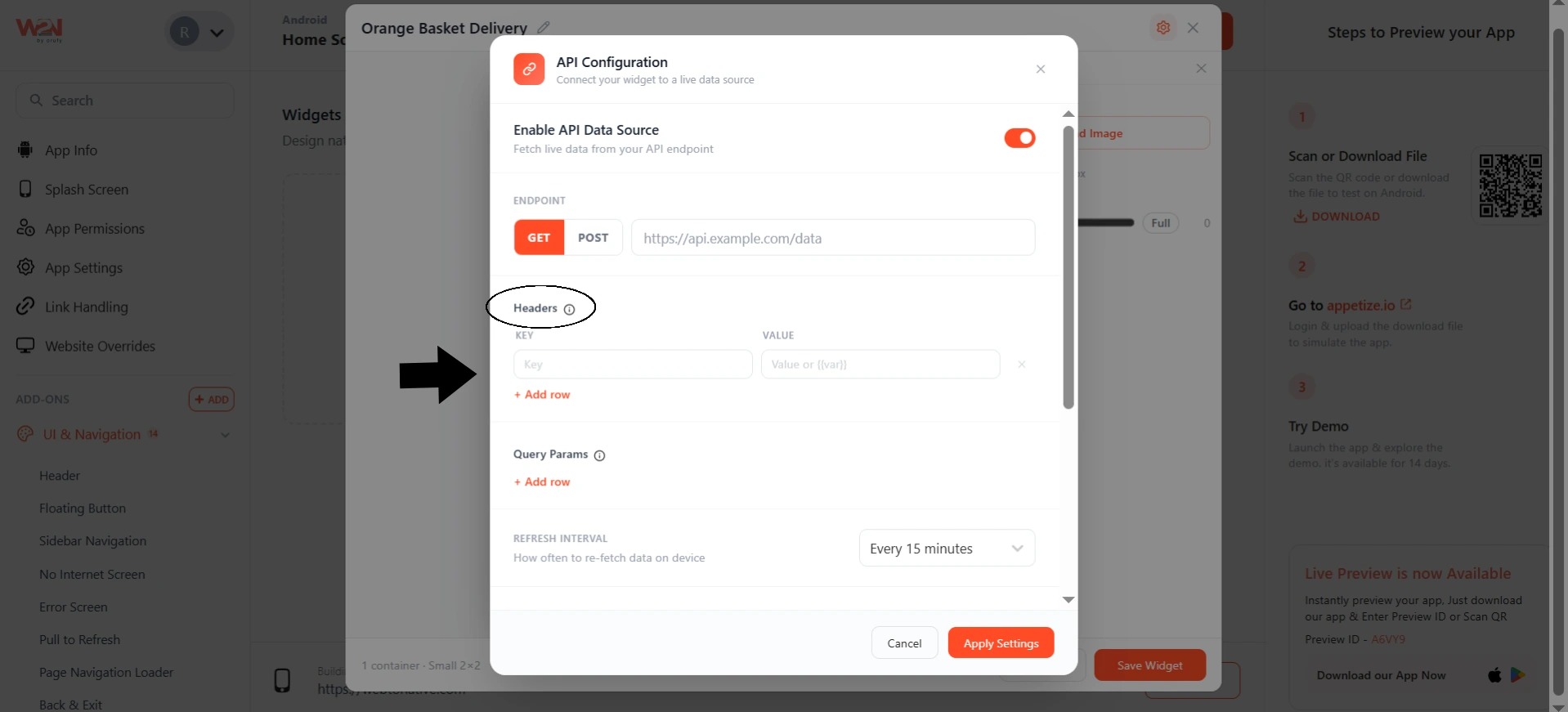
- Headers support dynamic variables. Under the Headers field, click + Add row to add a Key and Value pair for anything your API requires in the request headers. Your backend needs to know whether a request originated from the app or from a widget. You can attach custom HTTP headers as key-value pairs.
Example, api-source: webtonative-widget
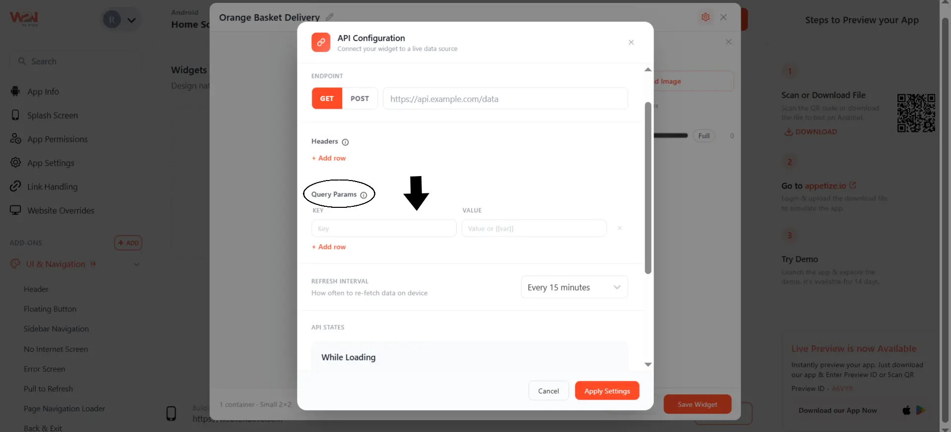
- Query Params support dynamic variables. Under the Query Params, click + Add row to add a Key and Value pair to allow you to customize API responses without changing the endpoint.
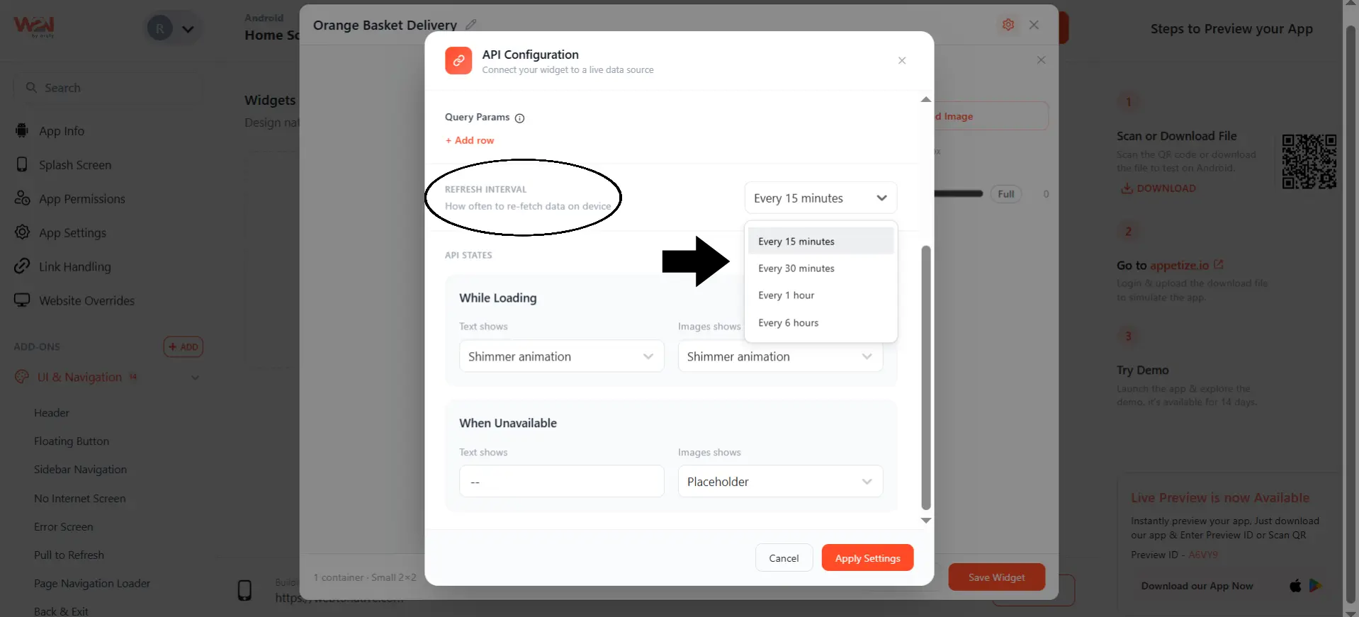
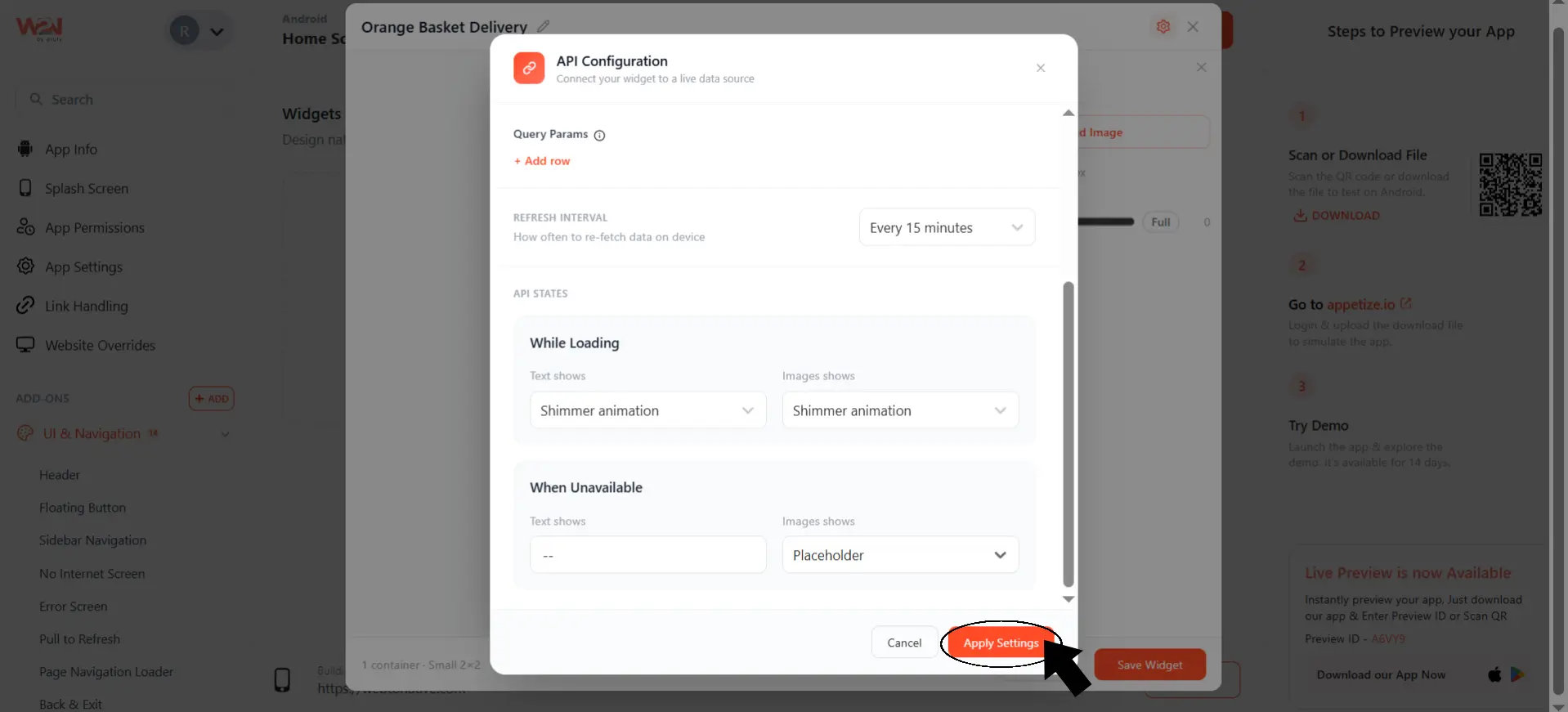
- You should set the Refresh Interval to control how often the widget re-fetches data on the device. It includes every 15 minutes, 30 minutes, 1 hour, or 6 hours.
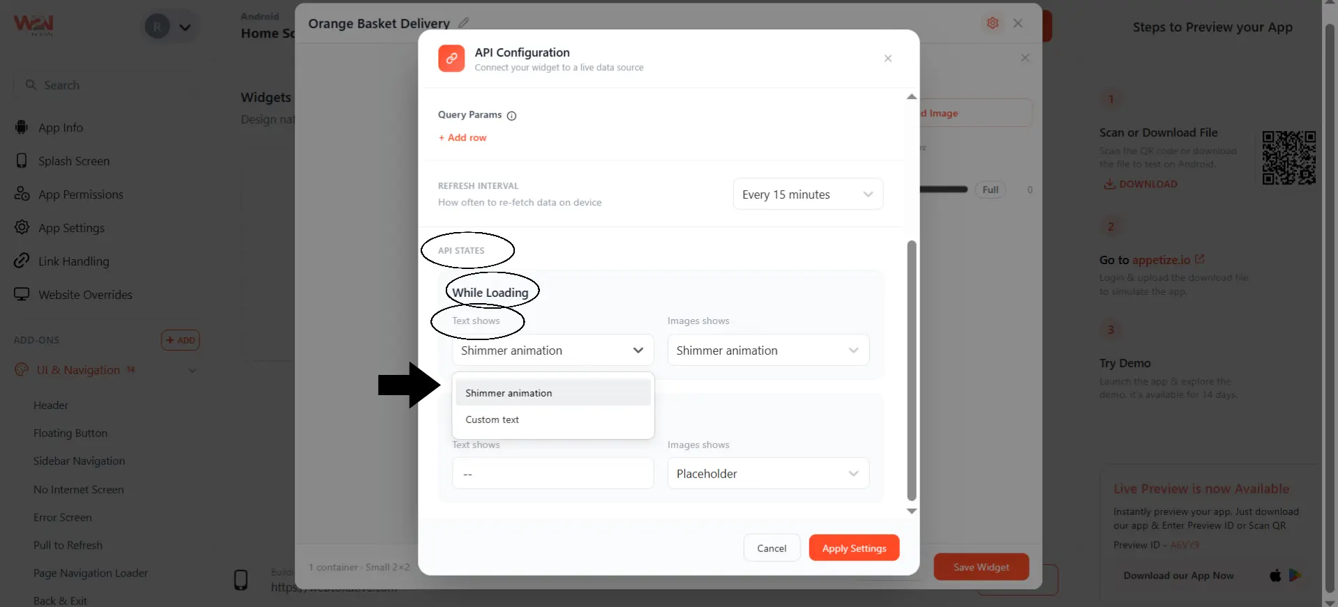
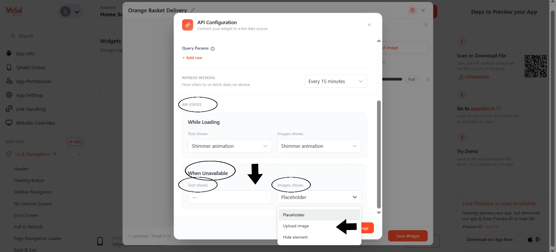
- Inside API States, choose what the widget shows While Loading and When Unavailable. You have to select the text and image that will be displayed on the Widget. So it never looks broken while data is being fetched.
- While Loading
If your API is still fetching data, you can display placeholder text or placeholder images instead of leaving the widget empty.
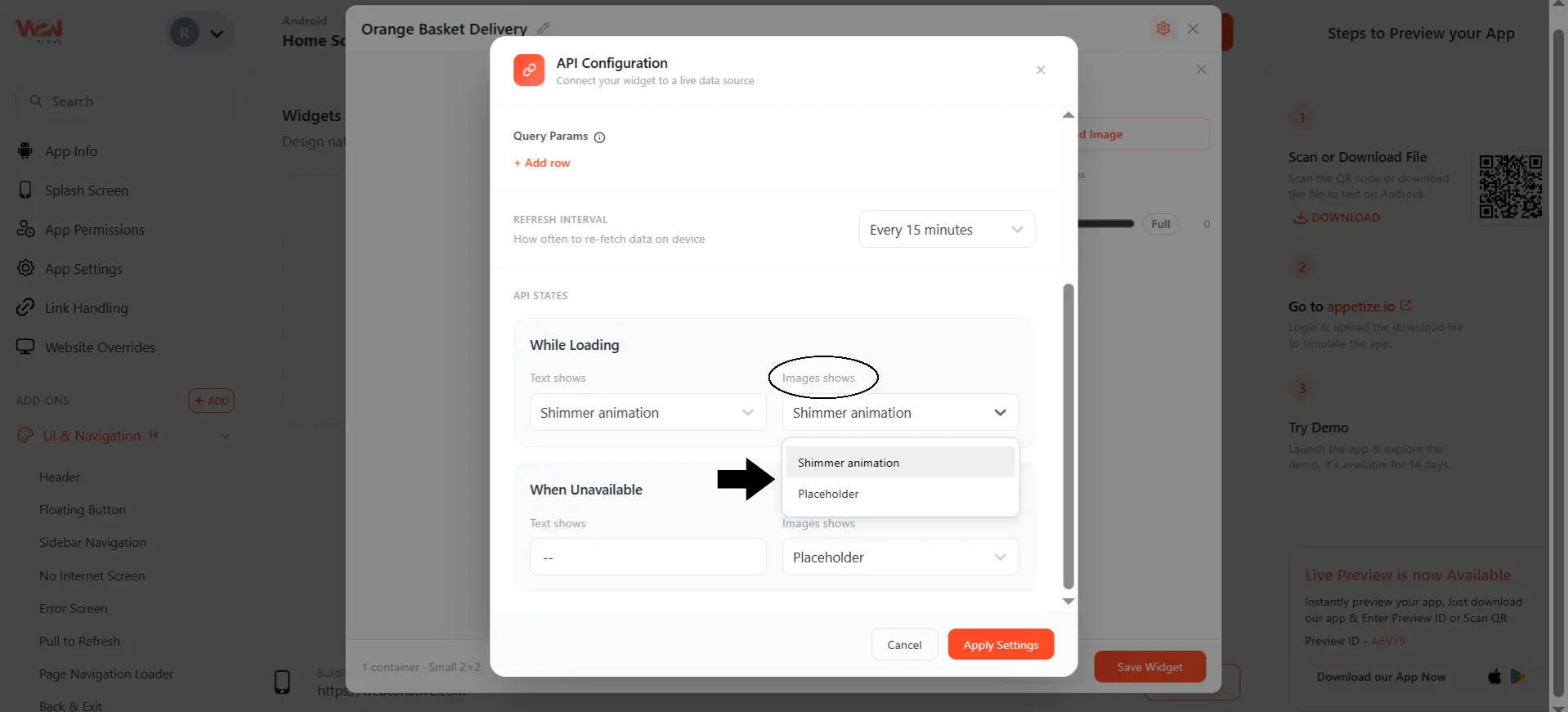
- While Unavailable
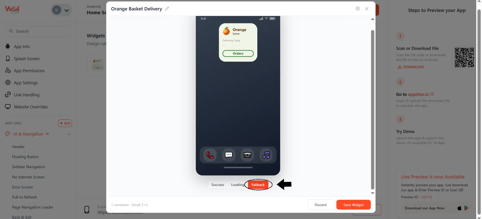
If the API request fails or a specific field is missing, you can define fallback values for both text and images.
Click Apply Settings to save the API connection to the widget.
Preview API States
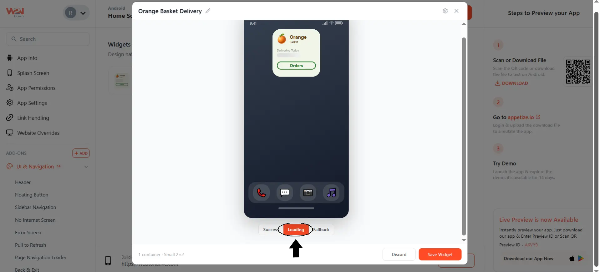
Once the API is configured, use the Success, Loading, and Fallback tabs below the phone preview to see exactly how the widget will look in each state.
- Success shows the widget as it appears when the API call returns data successfully.
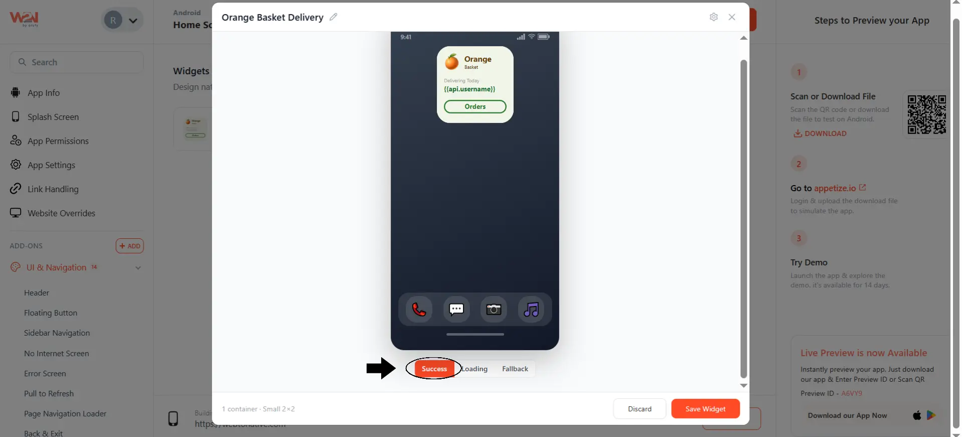
- Loading shows the shimmer animation or image for the while loading state.
- Fallback shows the fallback text or image you set for the when unavailable state.
Using Dynamic Variables in Content
When editing a text element, you can bind it directly to a field from your API response using the format {{api.fieldName}}, for example {{api.username}}. Once the API is configured and connected, the widget replaces this variable with the actual live value from your endpoint.
Managing Your Widgets
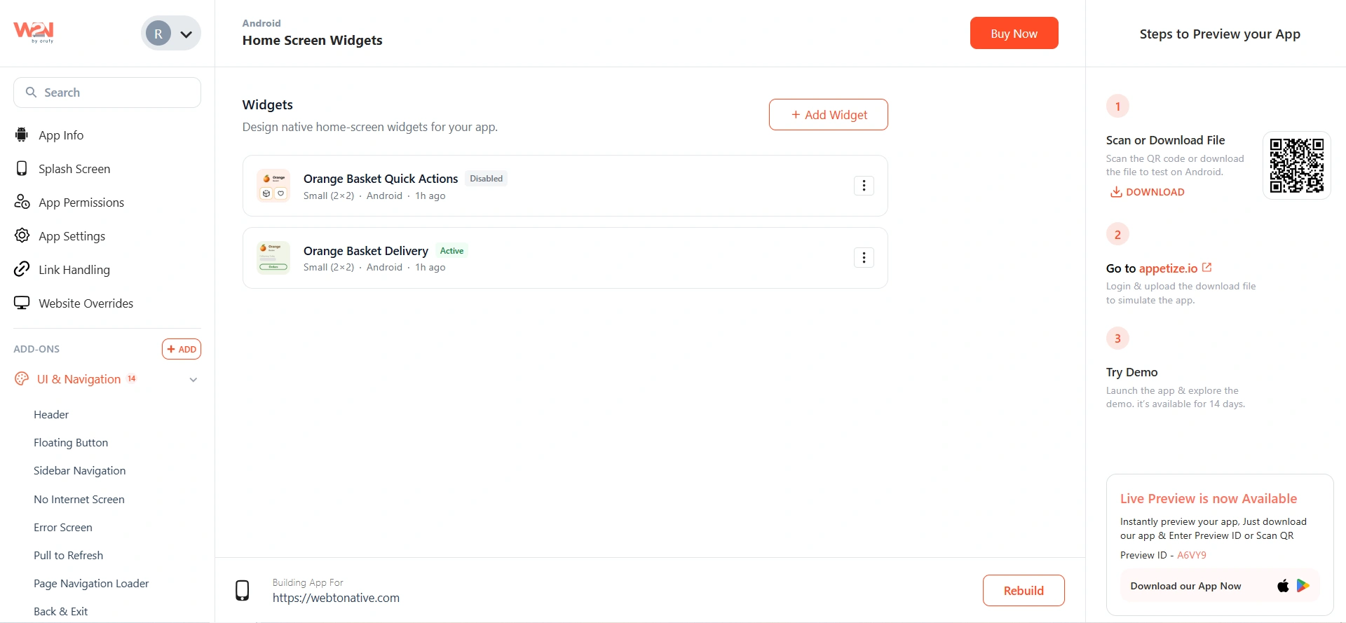
Each widget you create appears as a card in the list form, showing the name of the widget, size, name of the platform, and when it was last updated, with a status badge such as Active or Disabled.
As you click on the three dots, three options appear:
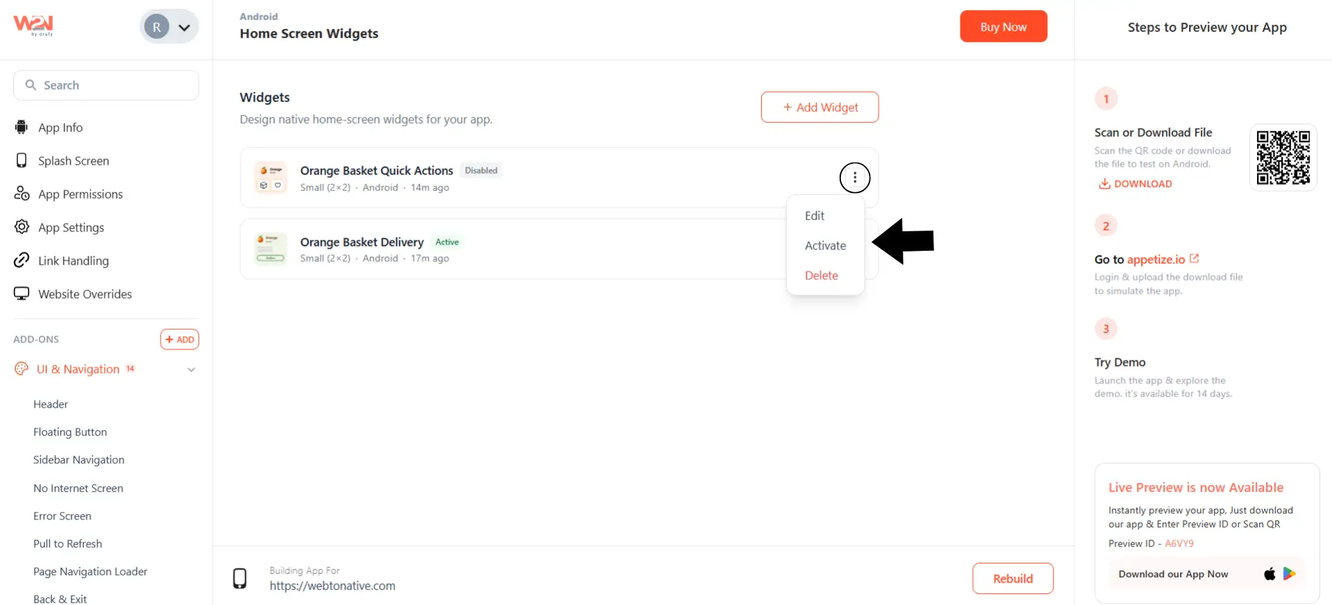

Edit
Click on the option that opens a widget editor to edit the content, color, API configuration, and image.
Activate or Disable
Click on the option that either activates or disables the widget.

Delete
Click on this option to permanently delete the widget.
When a new widget is created, by default it is Disabled. So, activate once you are ready for it to appear on the home screen.
Scrollable List Widgets — Large Size Only
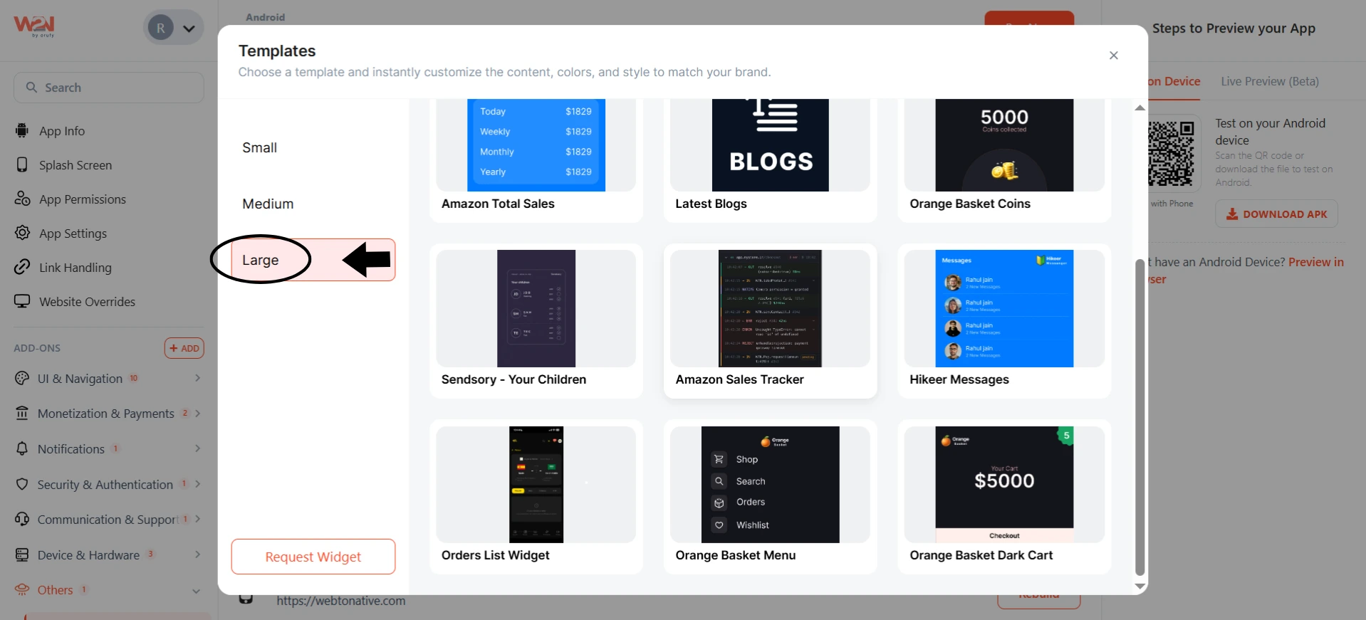
When you pick "Large" as the widget size, some of the templates are list templates. A List template allows your widget to show many items in a scrollable list. Here's how it works.
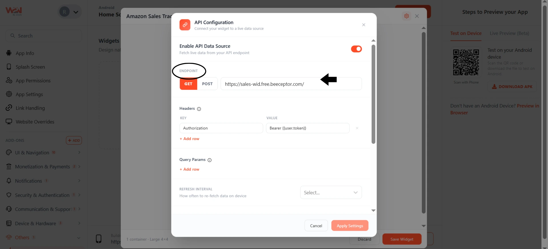
Configure the API
Click on the settings icon. Set the API endpoint.
The only thing to remember in case of a List template is that the API must return a list of items, not just an item.
Show the Data Using {{item.product}}
Tap on the list inside the widget. Now a text box opens with two fields: Content and Colors.
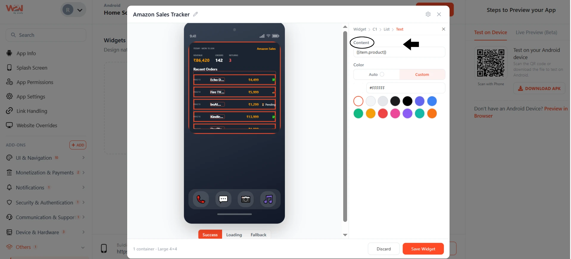
In the Content field, you have to enter the variable name stored in the API. You must enter the variable in {{item.fieldname}} format instead of just the variable name.
{{item.product}} — shows the 'product' field from each list item
For example, if your API response has a field called Product, you have to enter {{item.product}}.
Check your API response and note down the real variable name. The content field must match the variable names.
You only have to set this once. The widget automatically repeats it for every item in your list. So, row 1 shows the name of item 1 and row 2 shows the name of item 2.
In the Color field, you have to select the color for the list widget.
Customize the Widget
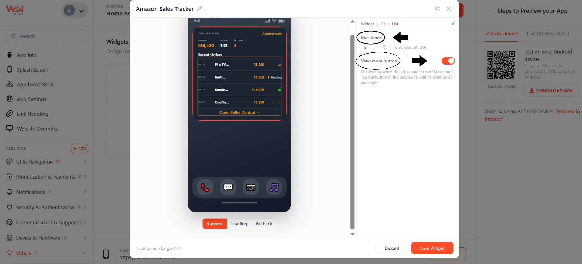
1. Max Items: You can control how many items to show in the widget. You can also control whether to show the View More button or not from the toggle.
2. Button
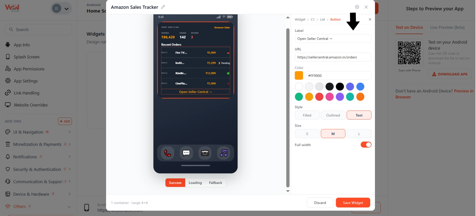
-
It will only be visible if you have toggled on the View More button.
-
You can edit the button text from the Label field.
-
You have to enter the URL where the user will go as they click on the button in the URL field.
-
You can customize the appearance of the button, such as color, style, size, and width.
Once your API is connected and the fields are mapped, click Save Widget and your scrollable list is live.